01
Home
Home
02
Work
Work
03
About
About
04
Playbook
Playbook
05
Partners
Partners
Culture
Contact
News & Insights
We partner with brands at their moment of transformation,
whether protecting a legacy or building one.
We partner with brands at their moment of transformation, whether protecting a legacy or building one.
VIEW PROJECTS
VIEW PROJECT
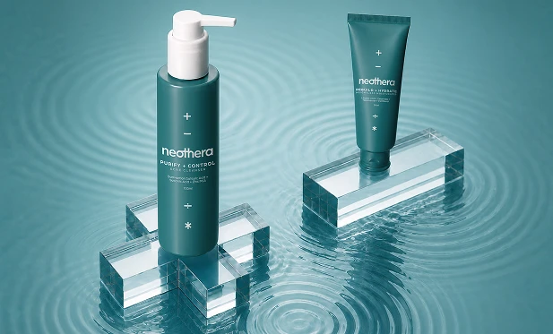
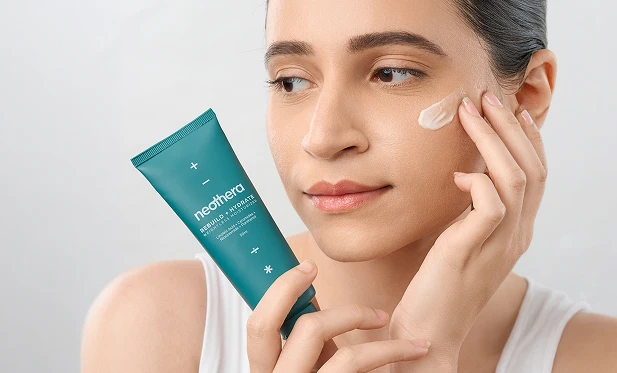
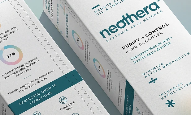
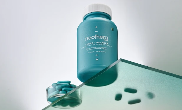
NEOTHERA
Consumer Research
Brand Strategy and Nomenclature
Identity and Packaging System
Art Direction
Website Design
Systemic Skin Health
VIEW PROJECT
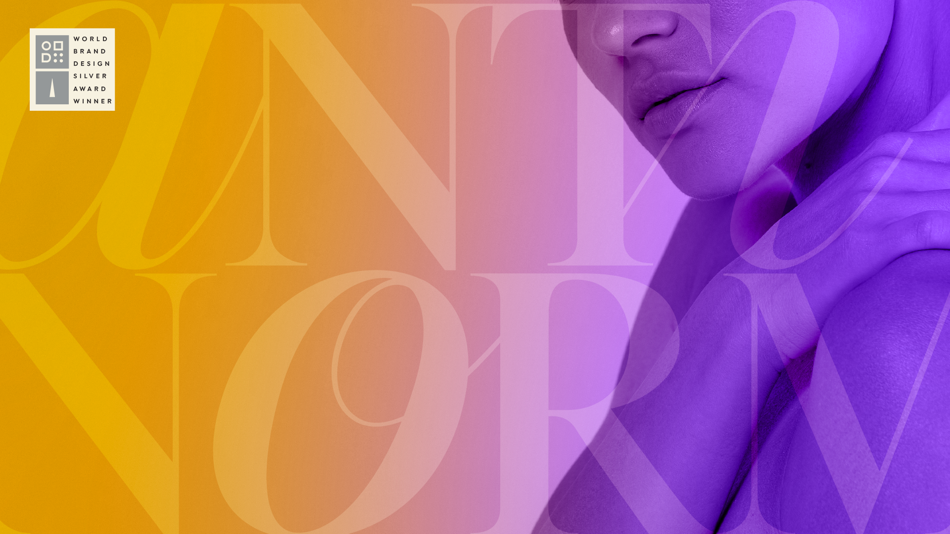
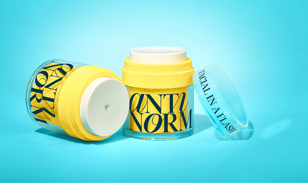
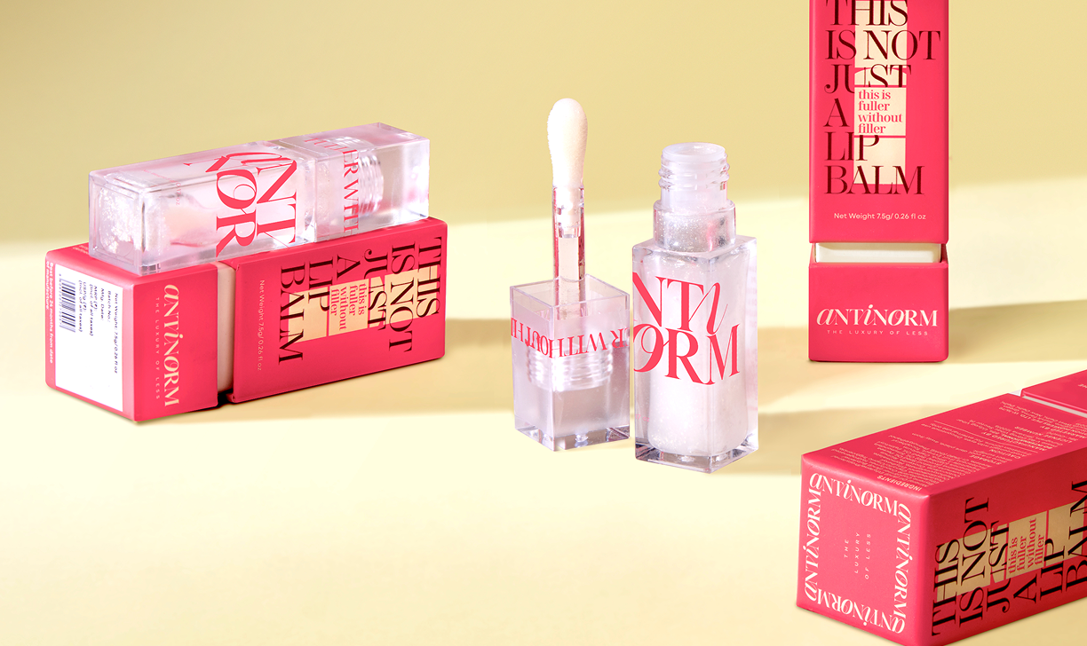
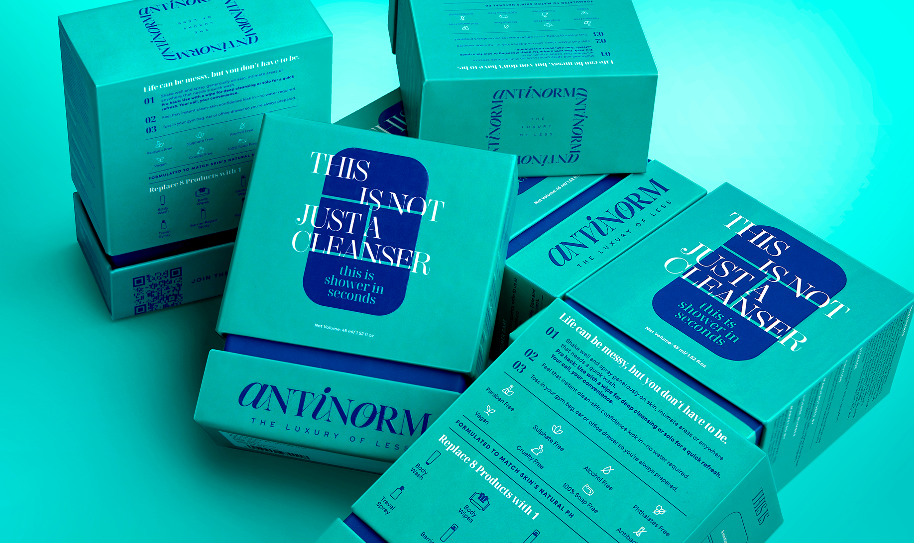
Antinorm
Brand Identity Sytem
Brand Strategy
Identity and Packaging System
Naming Convention
E-Commerce Website
Content Strategy
The Luxury of Less
VIEW PROJECT
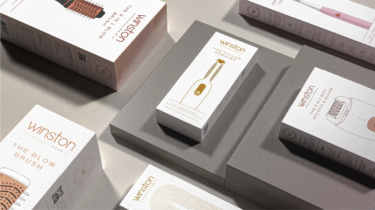
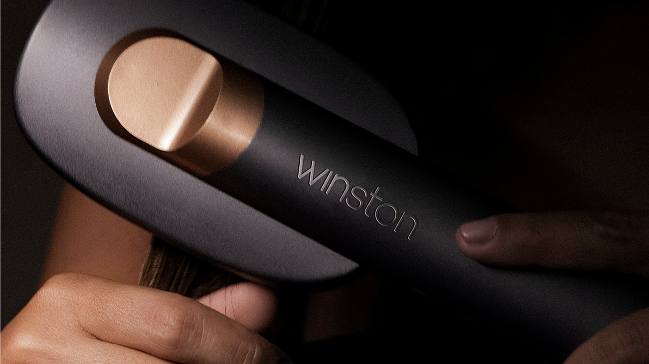
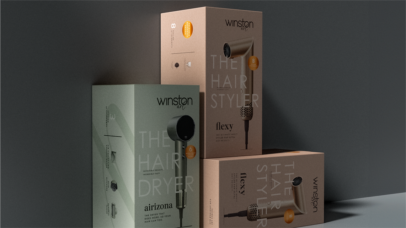
Winston
Consumer Research
Brand Strategy
Identity and Packaging System
Naming Convention
E-commerce Website
Elevating the Art of
Grooming
VIEW PROJECT
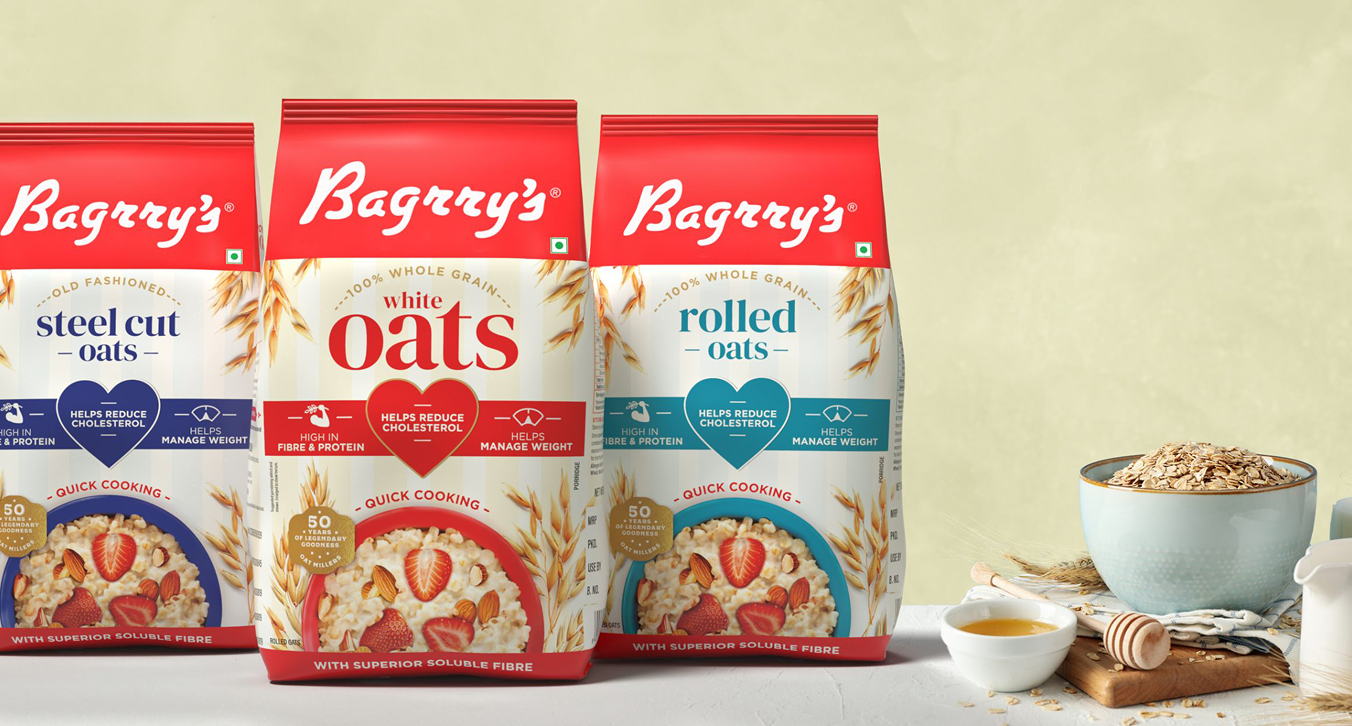
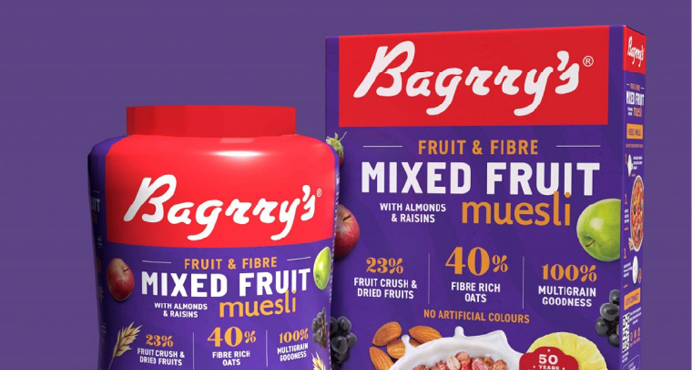
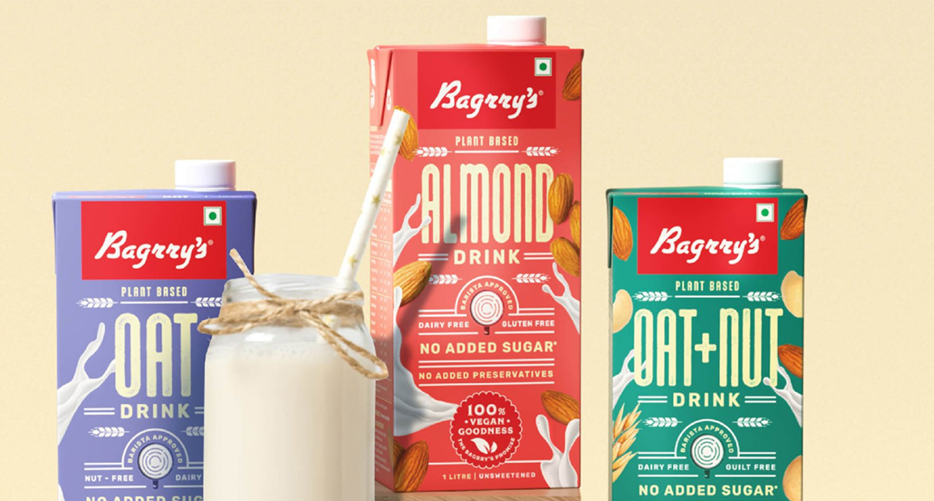
BAGRRY'S
Brand Architecture
Packaging System
Built on Legacy,
Made for Now
VIEW PROJECT
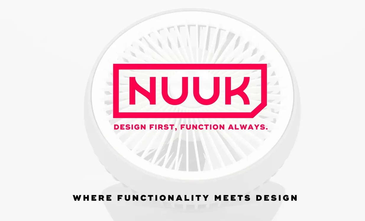
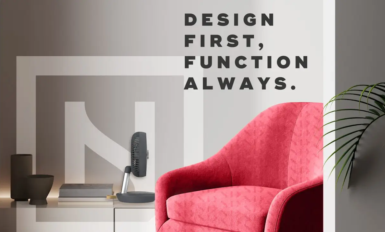
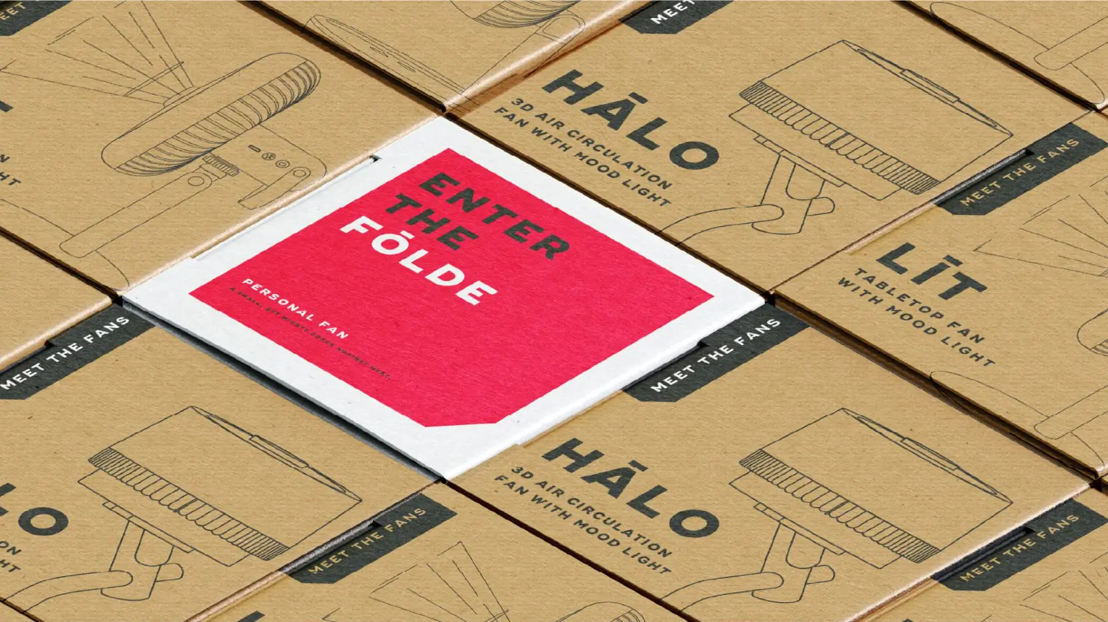
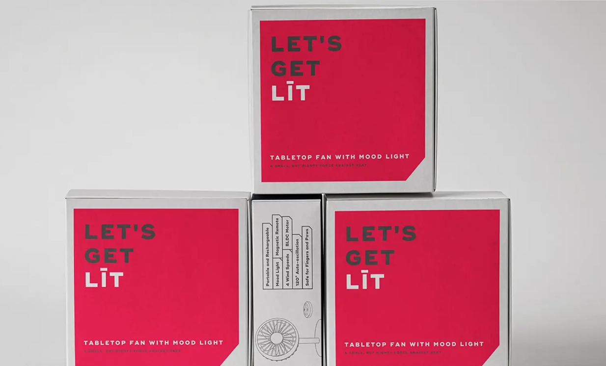
NUUK
Identity and Packaging System
Brand Strategy
Consumer Research
Positioning
The Soft Science of
Household Magic
VIEW PROJECT
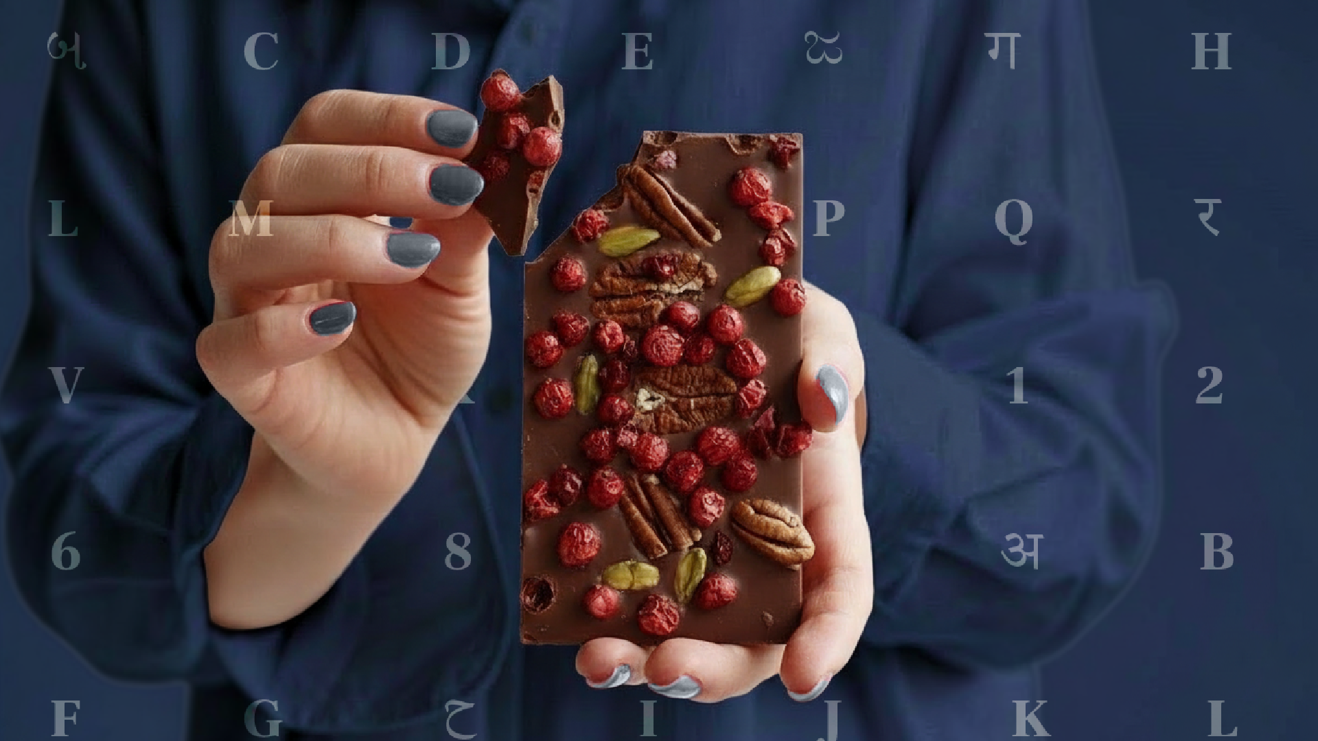
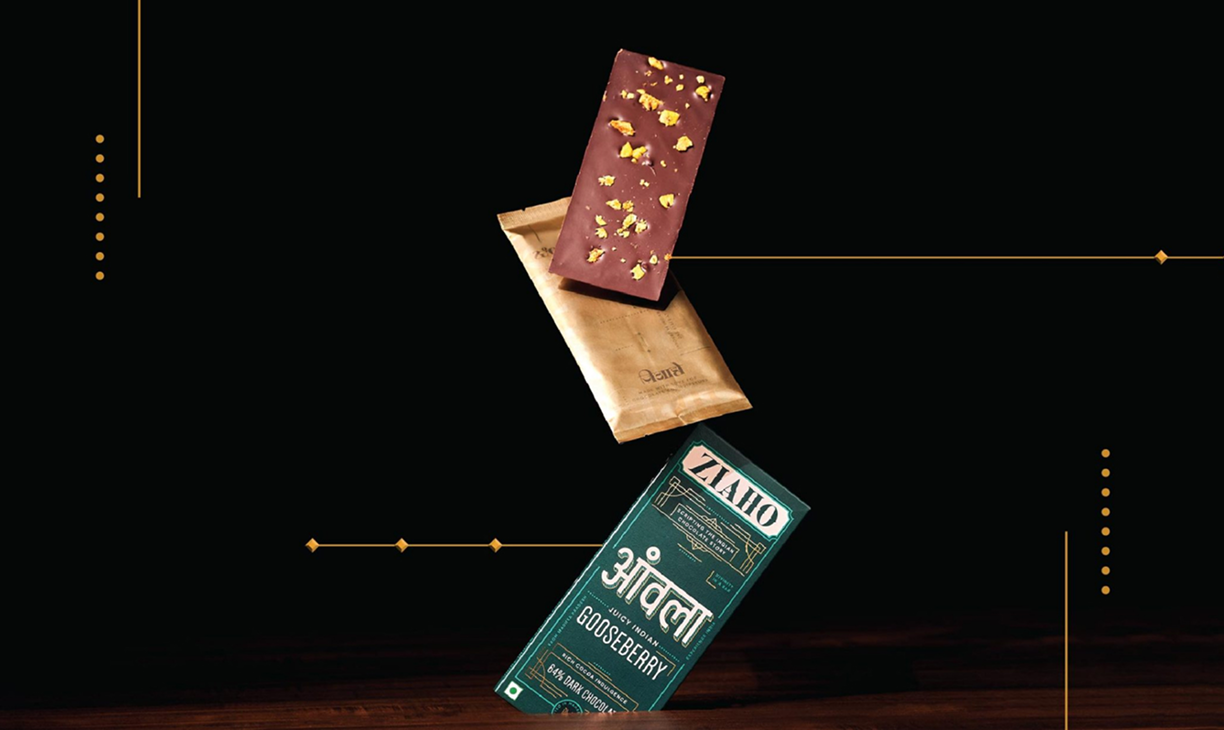
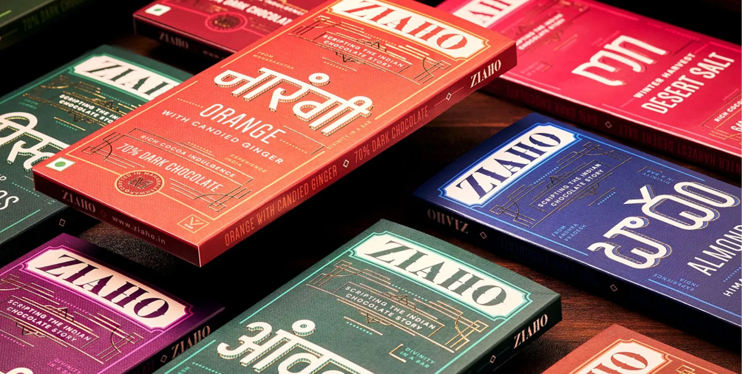
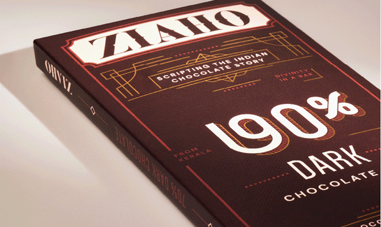
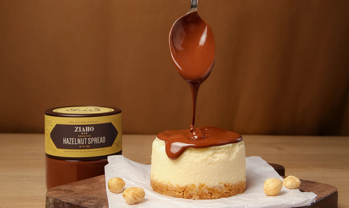
ZIAHO
Identity and Packaging System
Brand Strategy
Naming Convention
Positioning
Scripting the Indian
Chocolate Story
VIEW PROJECT
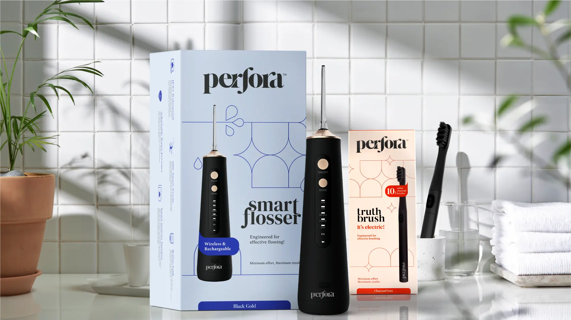
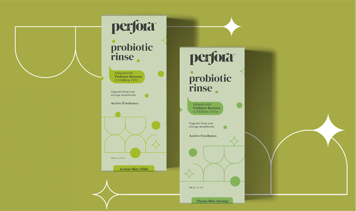
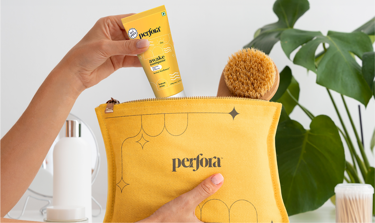
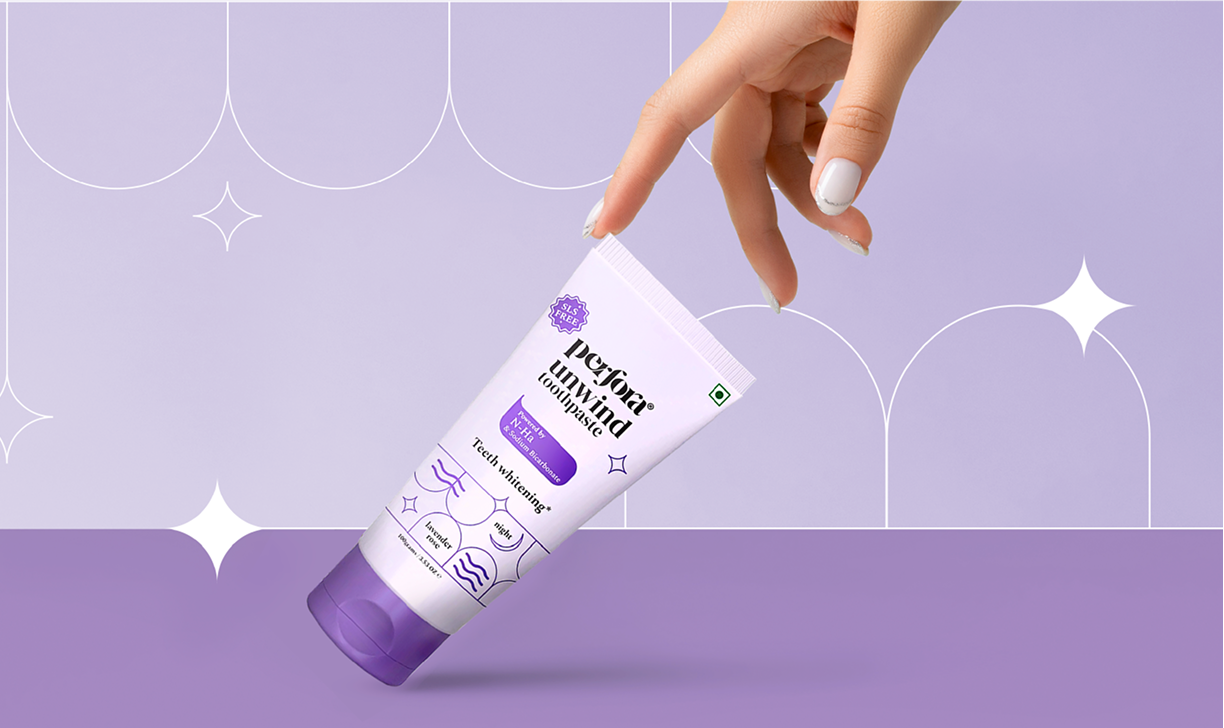
PERFORA
Identity and Packaging System
Brand Strategy
Consumer Research
Naming Convention
Putting The Care Back
In Oral Care
VIEW PROJECT
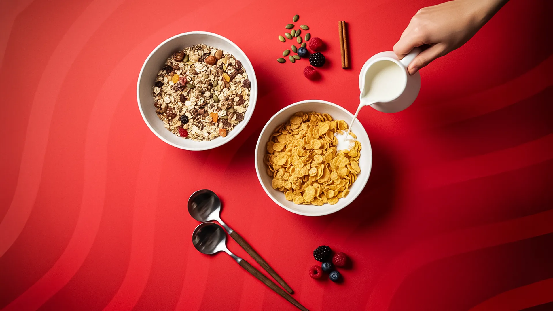
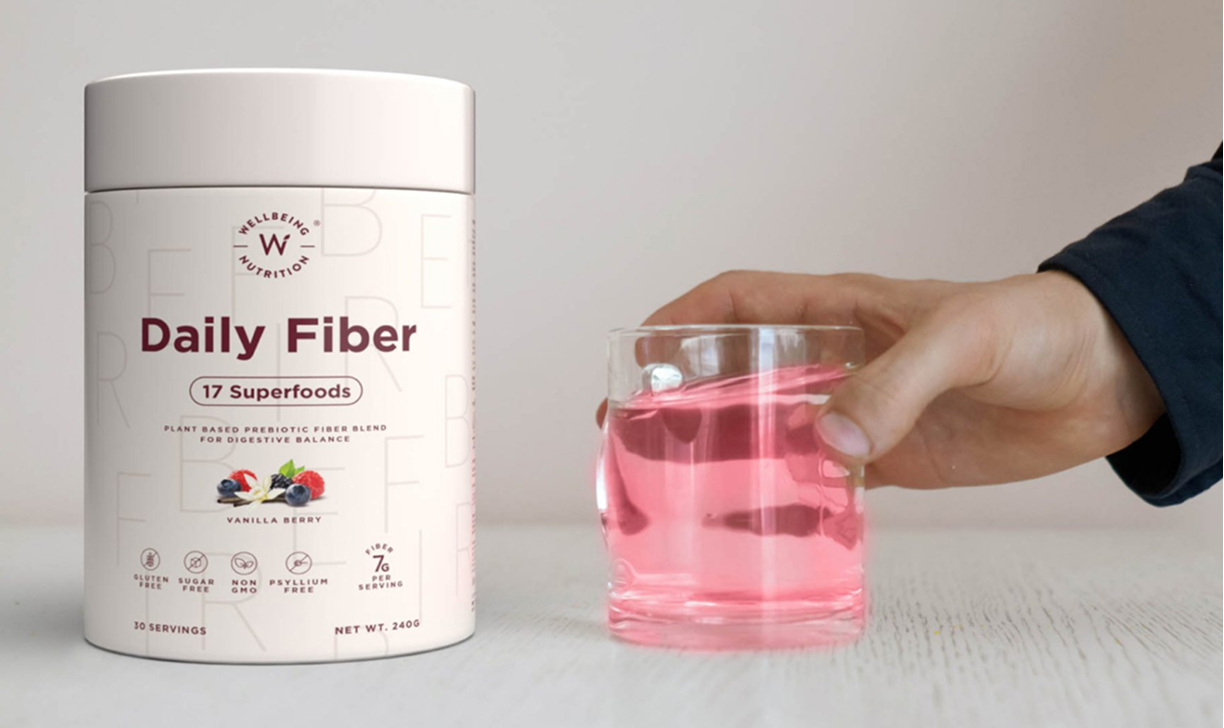
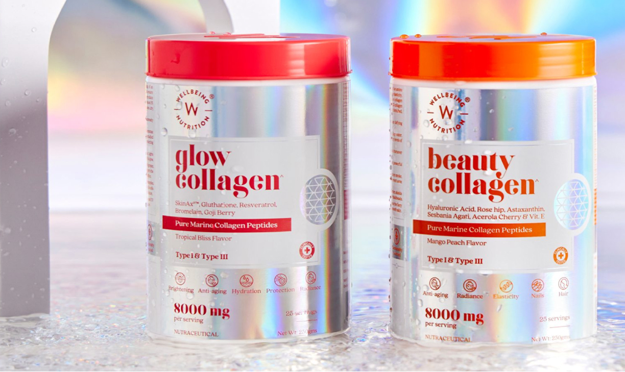
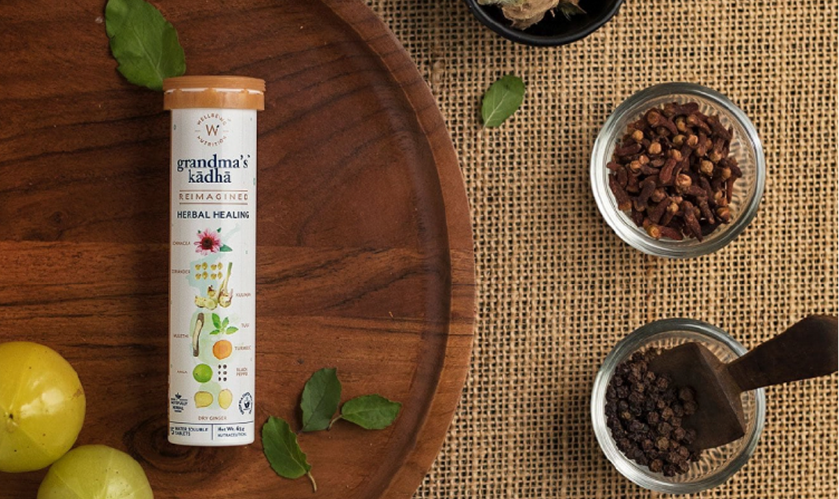
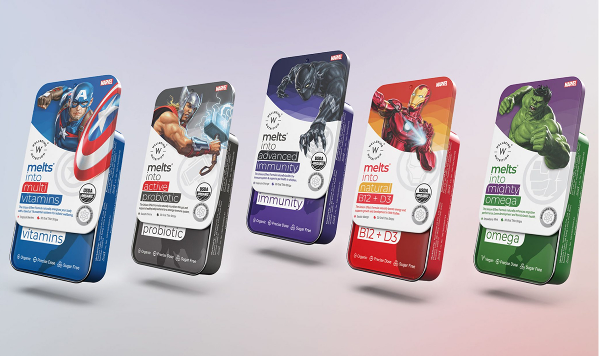
Wellbeing Nutrition
Brand Architecture
Content Strategy
Packaging System
Wellness Never Looked
This Good
VIEW PROJECT
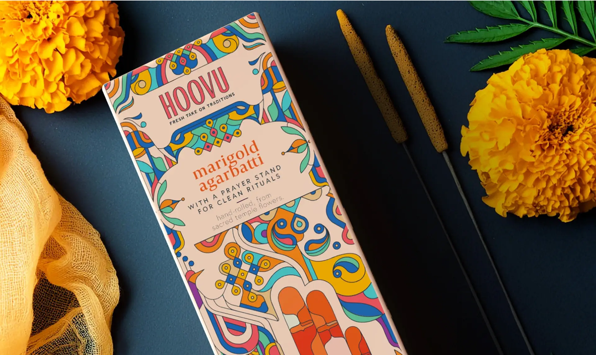
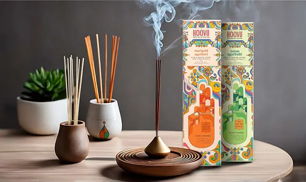
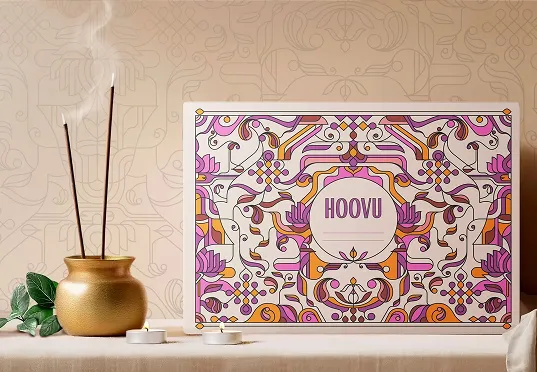
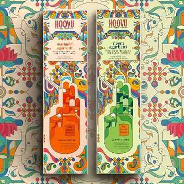
HOOVU
Consumer Research
Packaging Systems
Product Strategy
A Fresh, Floral Take
on Tradition
VIEW PROJECT
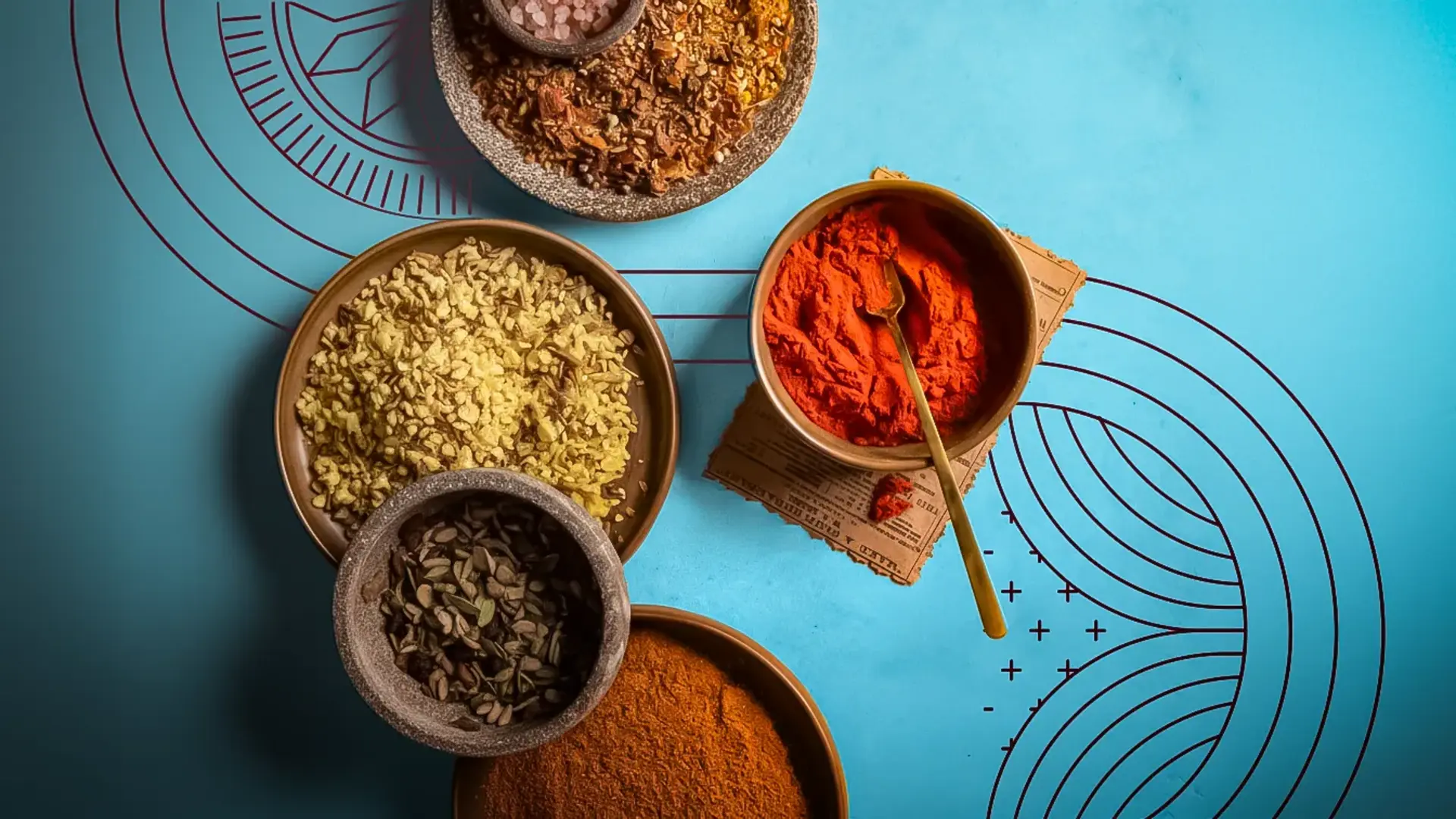
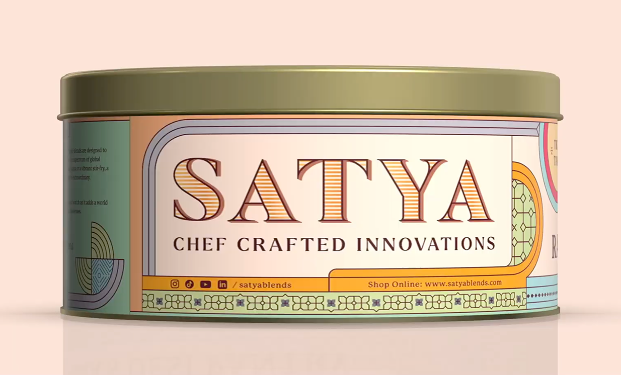
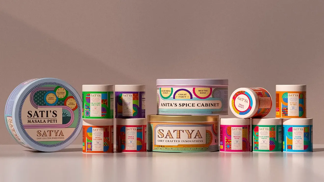
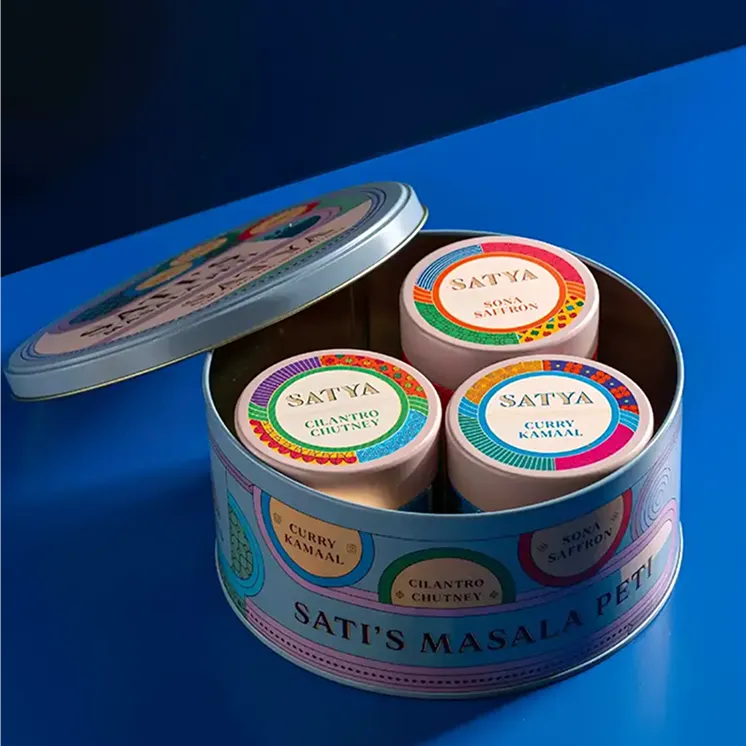
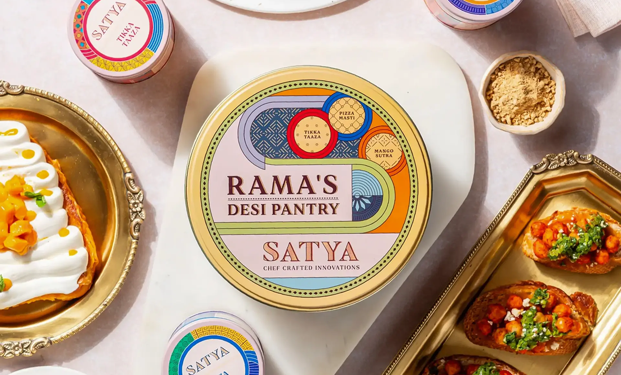
SATYA
Identity and Packaging System
Brand Strategy
Rebranding
Through Spice Routes
Old and New