• Making Oats India’s Own
  • The Masters Of Muesli
  • The Homegrown Giant’s Next Chapter
Making Oats India’s Own
  • Making Oats India’s Own
  • The Masters Of Muesli
  • The Homegrown Giant’s Next Chapter

CATEGORY

Breakfast Cereals
and Healthy Snacks

SCOPE

Brand Architecture, Brand Identity, Packaging System

Bagrry’s

MAKING OATS INDIA’S OWN

As with their pioneering muesli launch in 1994, Bagrry’s approached oats as an opportunity to enhance everyday nutrition. Their oats line features thoughtfully made variants make a typically Western breakfast staple more accessible and appealing to Indian consumers.

While revamping their packaging design, we took a distinct typography-led approach to make it an evolution (not a revolution), communicating not just the product’s nutritional benefits but also the brand’s legacy of innovation.

CATEGORY

Breakfast Cereals
and Healthy Snacks

SCOPE

Brand Architecture, Brand Identity, Packaging System

Bagrry’s

THE MASTERS OF MUESLI GET A MAKEOVER

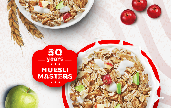
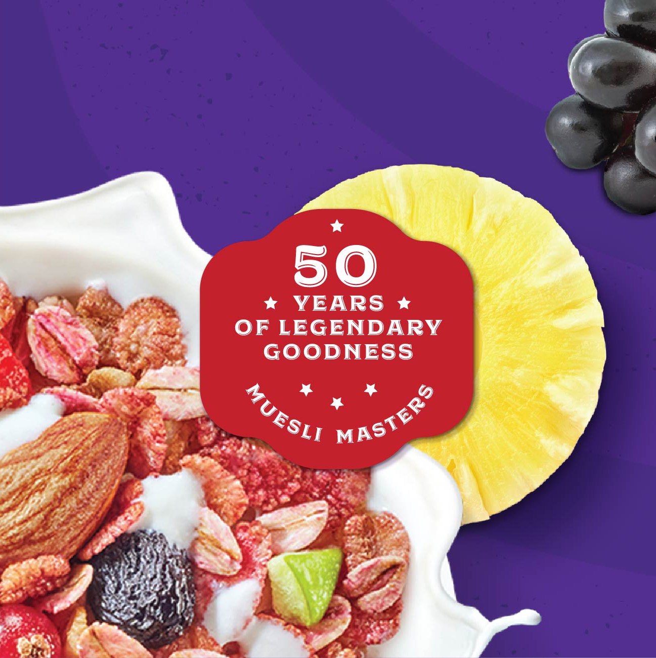
Bagrry’s launched muesli in India (the first to do so) back in 1994, and grabbed attention when it was served to then US President Bill Clinton during his India visit in 2000. Over twenty years later, the brand had reached 70,000 retail outlets in India as well as exporting to eight countries. Dubbed a ‘Cereal Killer’ by Forbes magazines for good reason, Bagrry’s has stood its ground against international brands and become India’s second-largest breakfast cereal brand after Kellogg’s. Today it is the pioneer of muesli in India, deeply beloved with loyalists in every corner of the country.

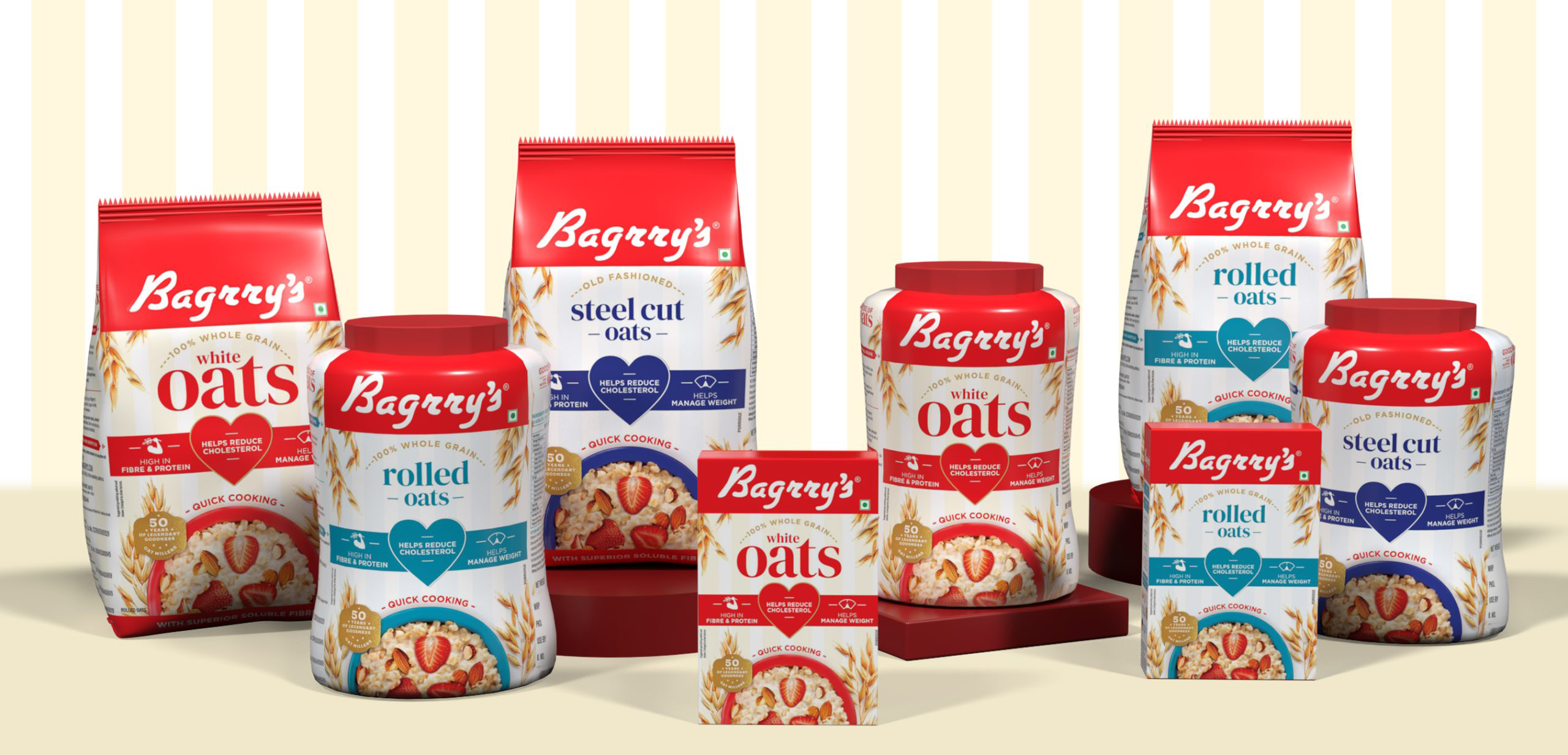
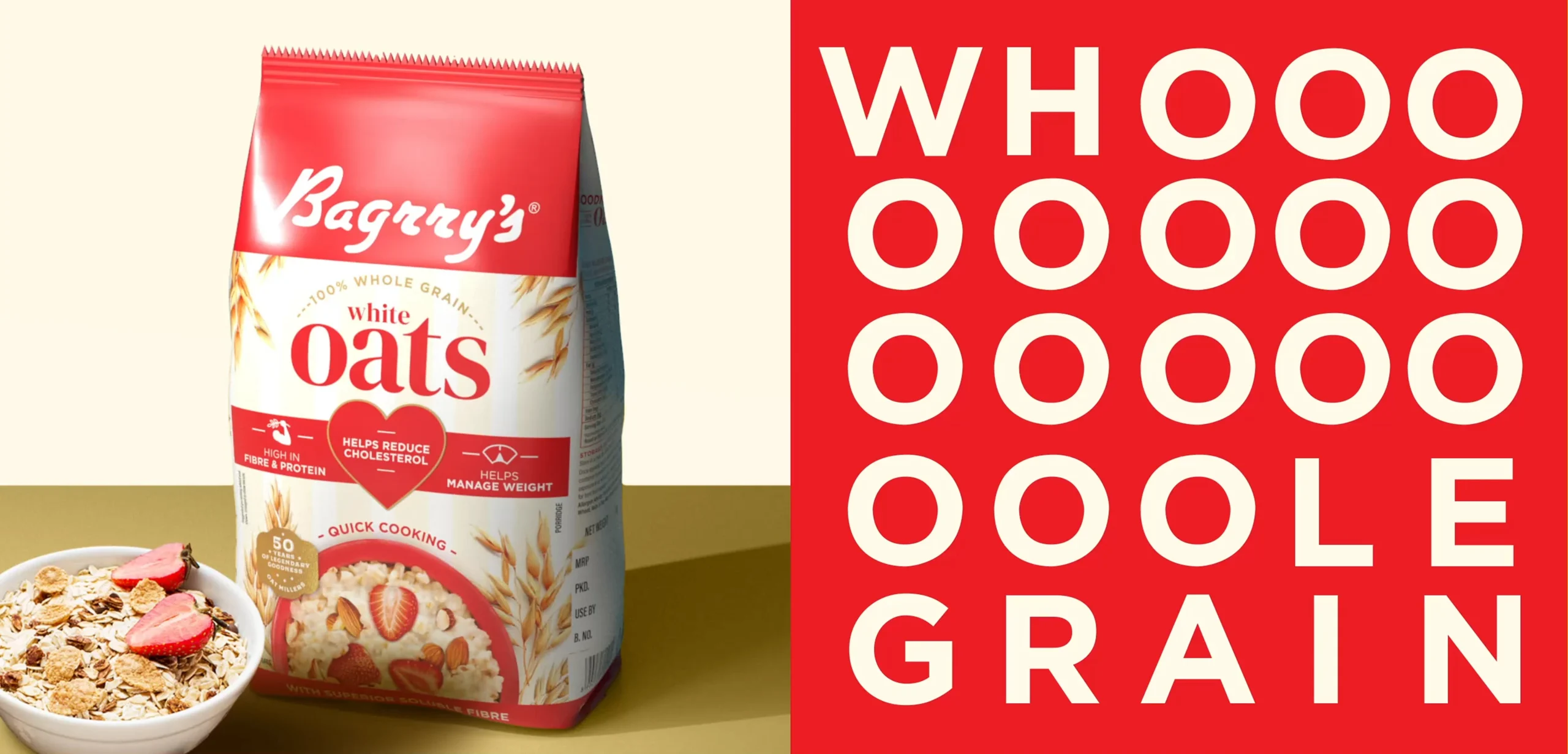
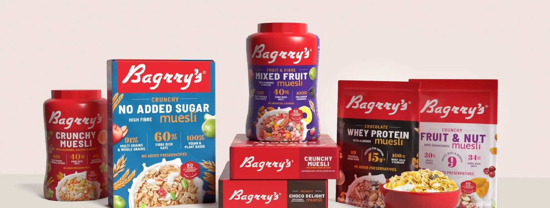
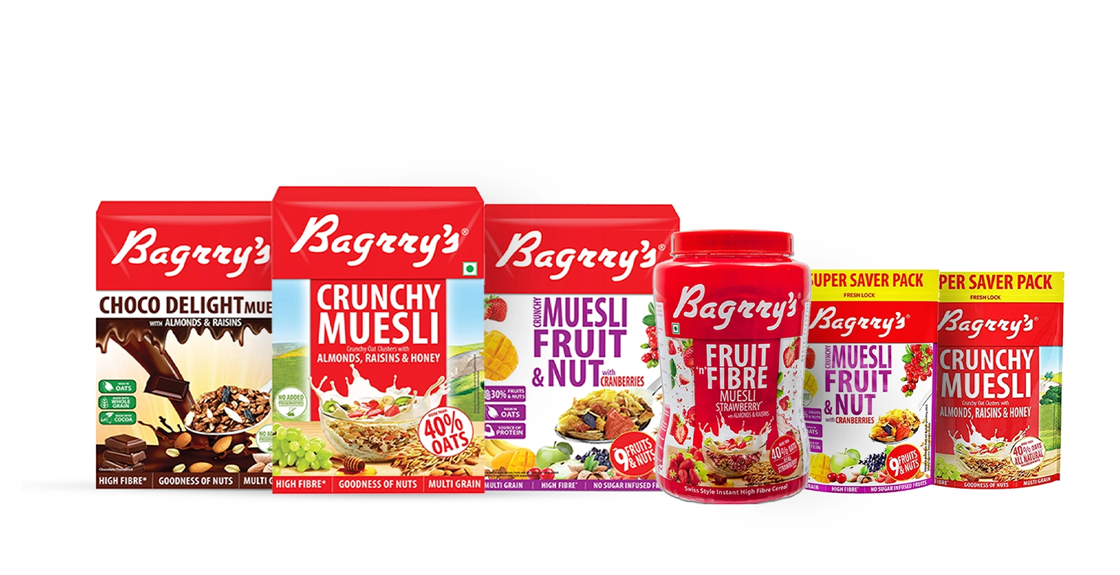
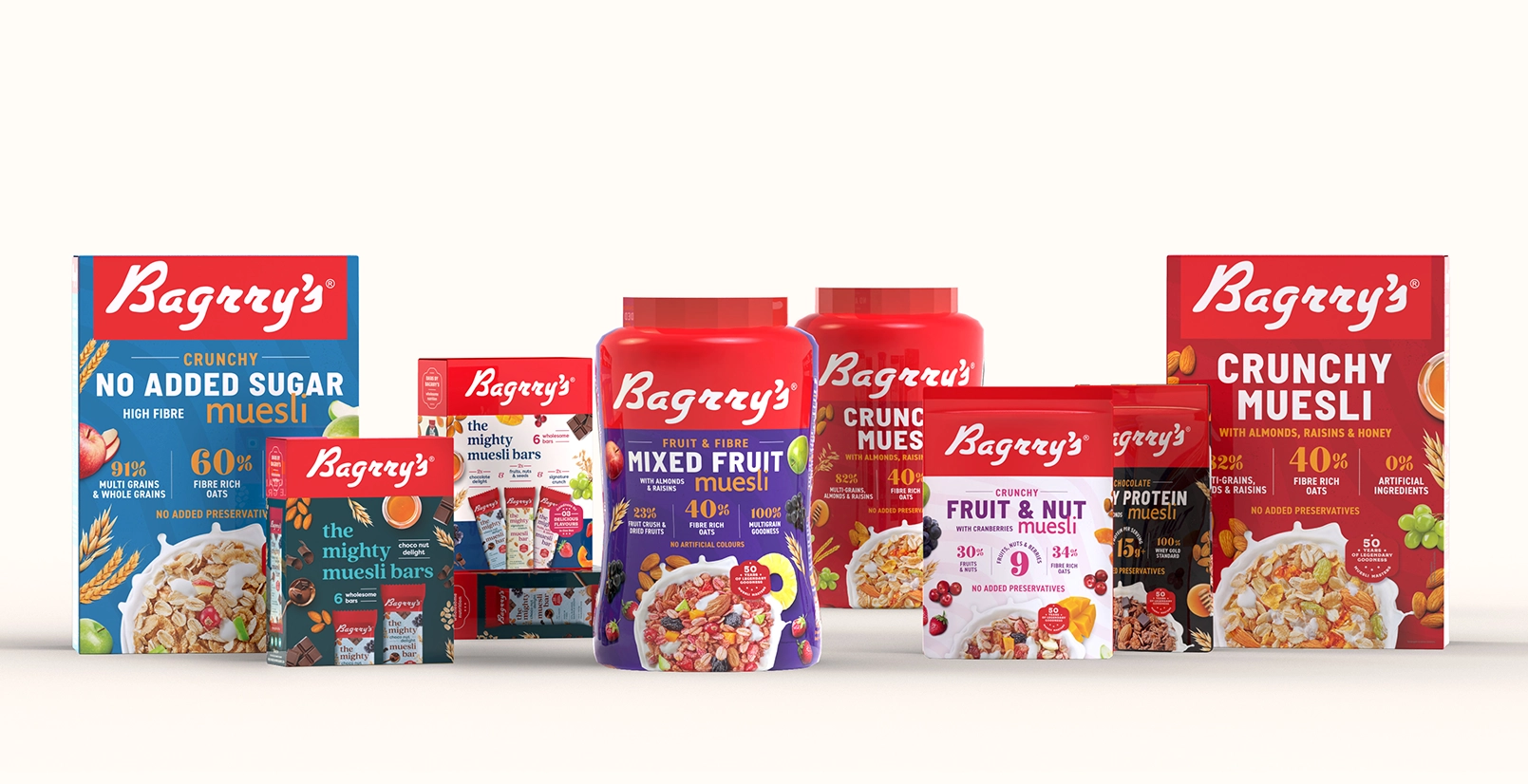
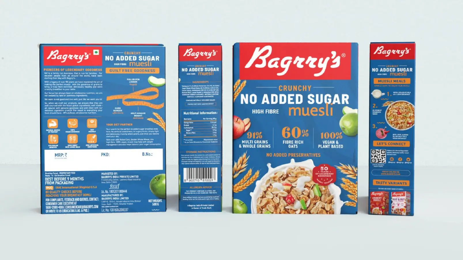
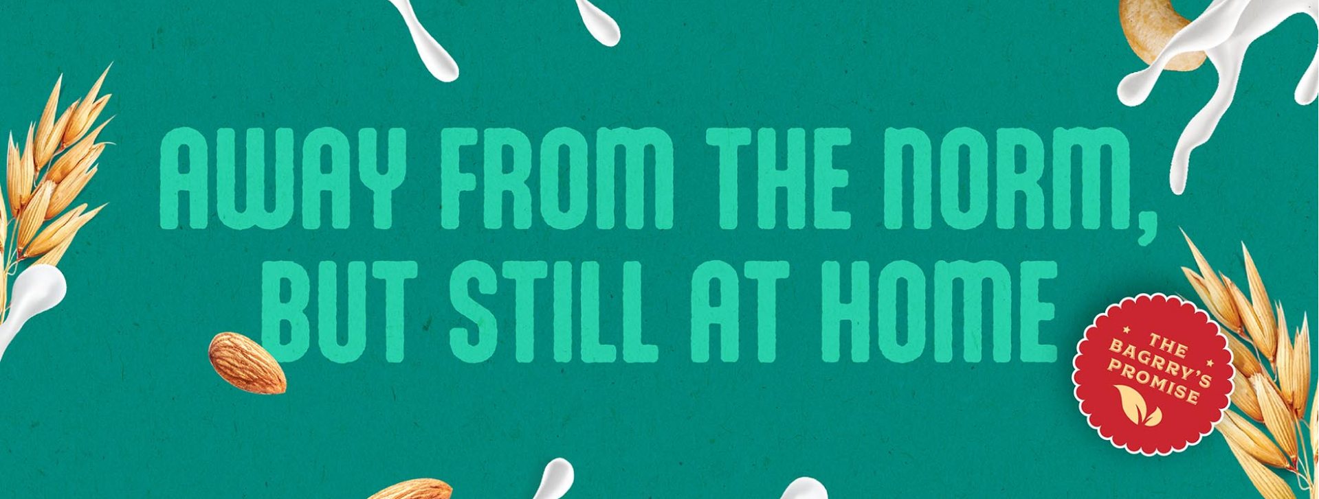
The challenge then, with revamping Bagrry’s packaging, was to retain their recognisable legacy, equity and loyalty built over the last 50 years, while giving it a contemporary update.

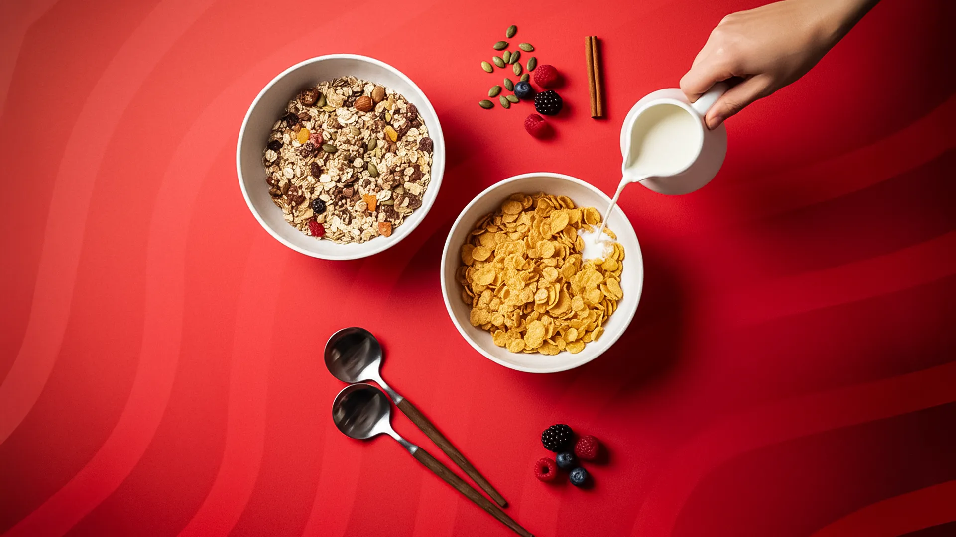
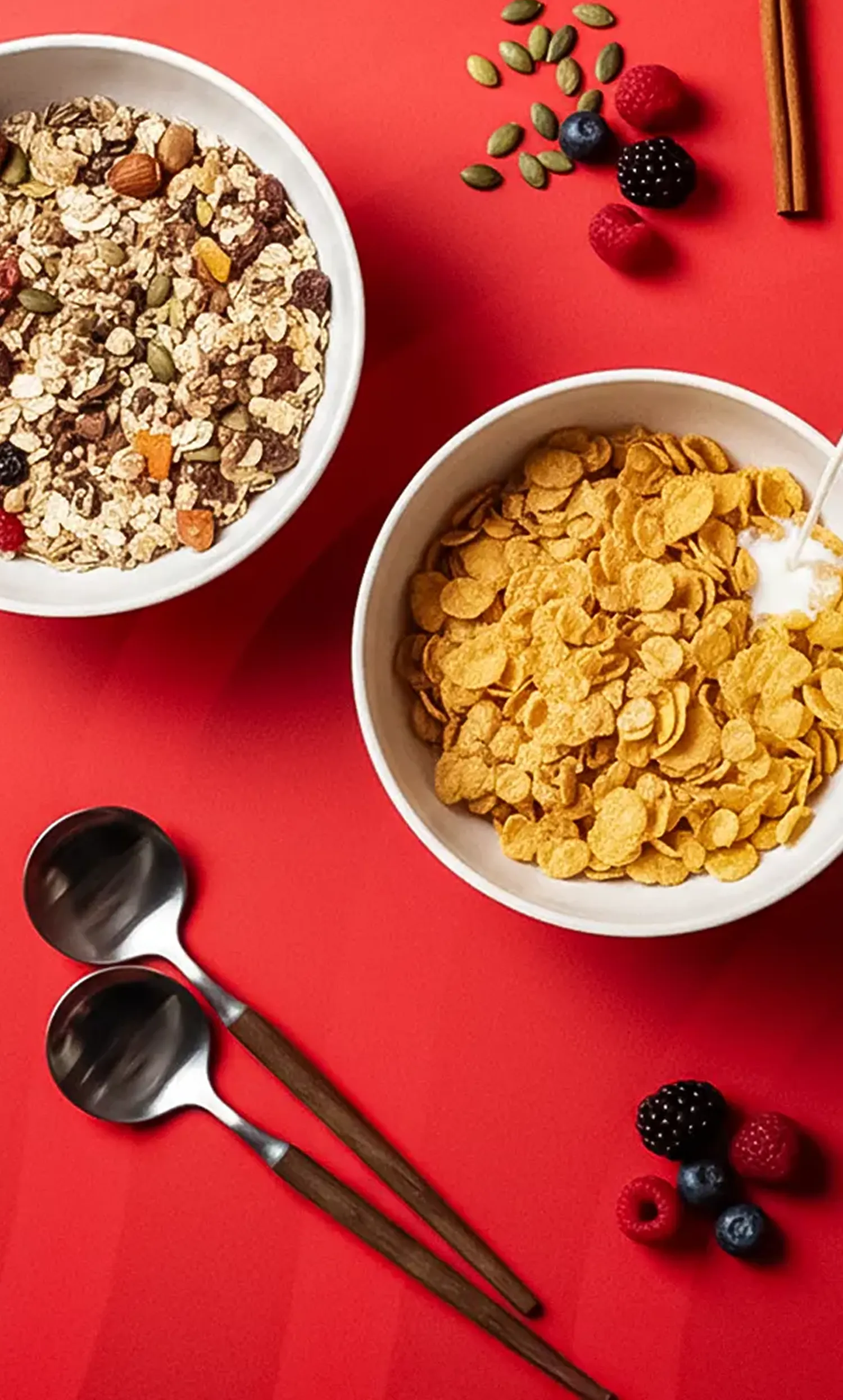
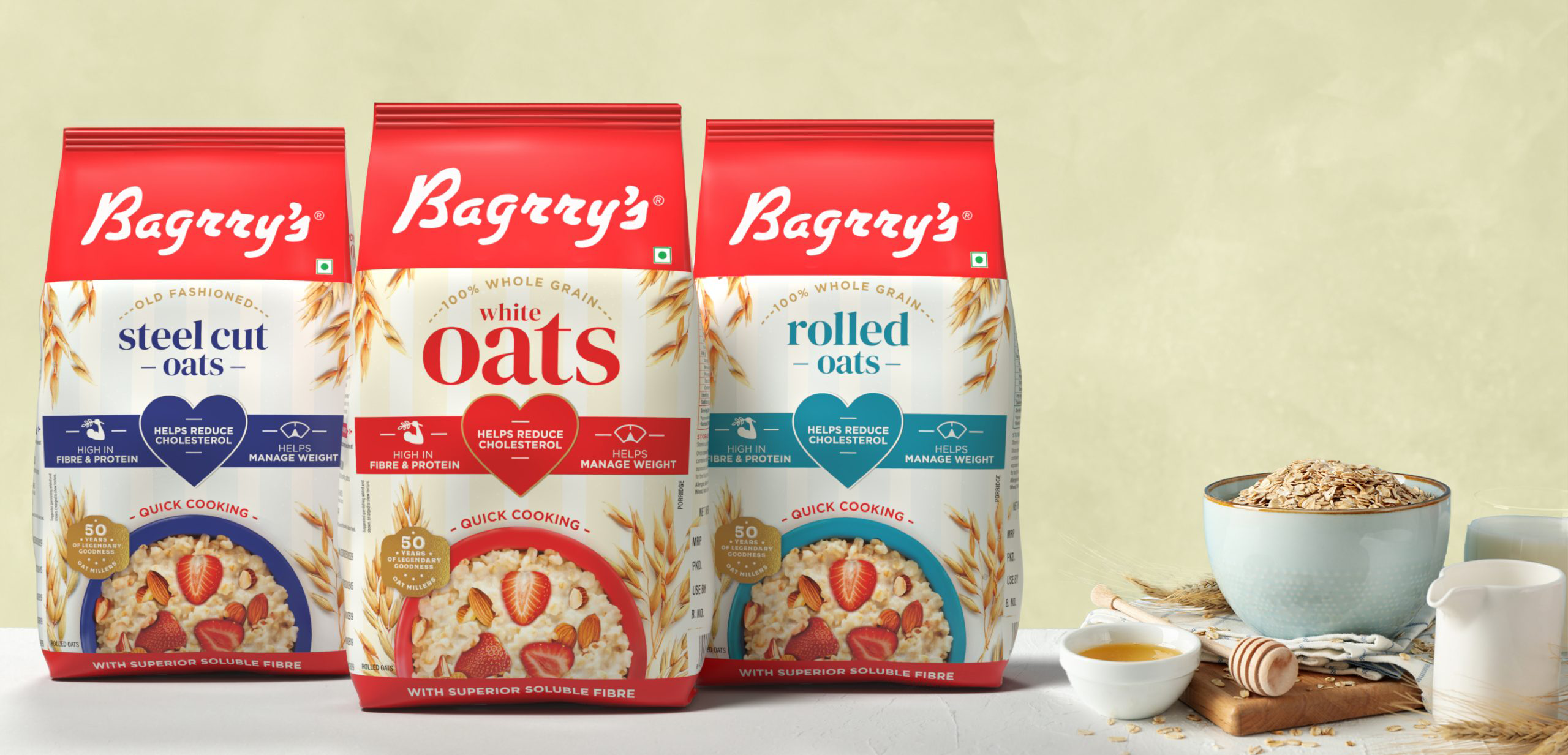
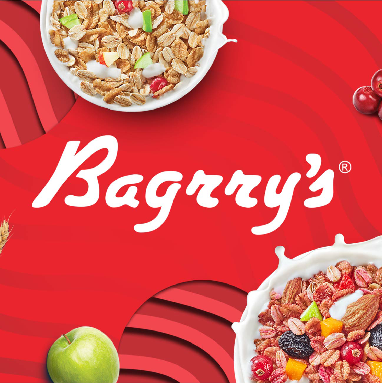
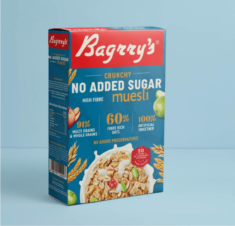
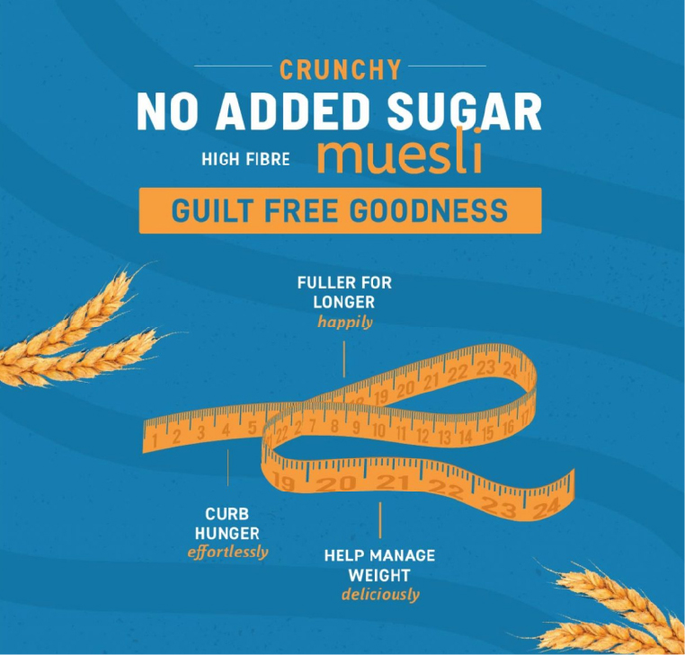
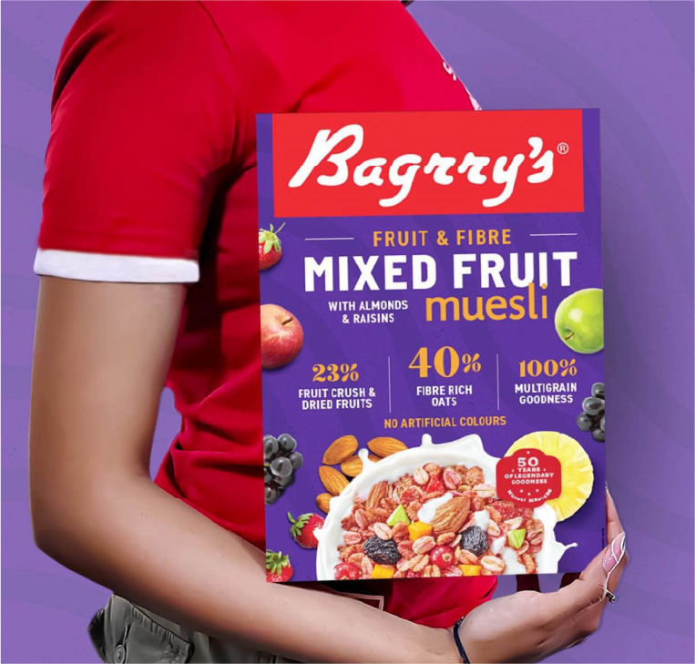
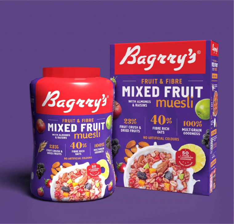
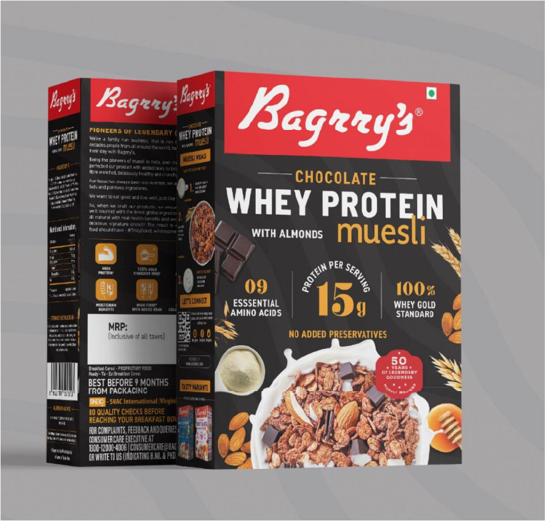
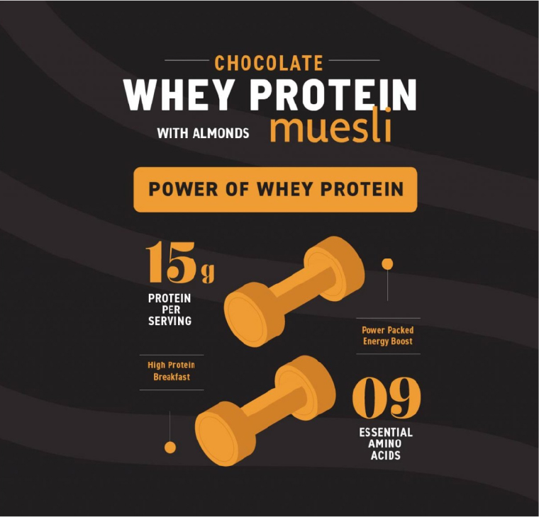
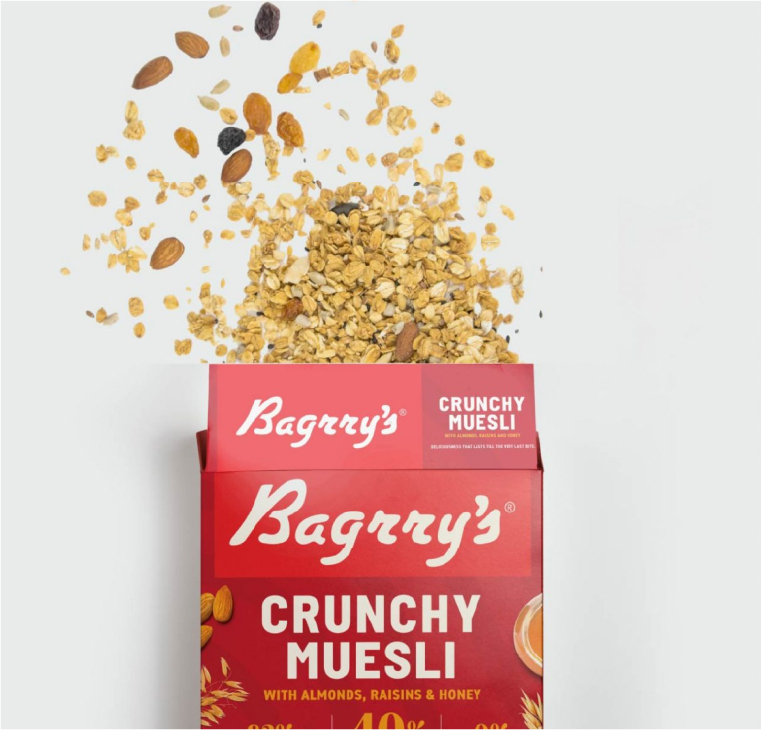
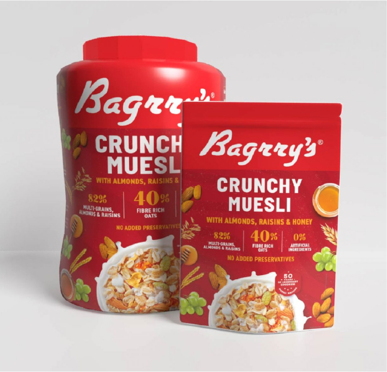
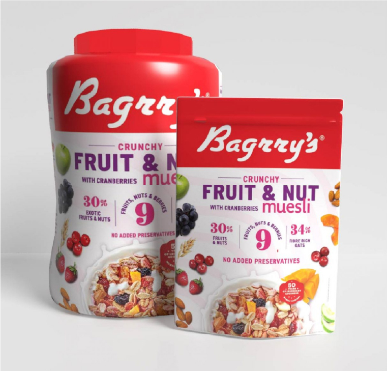
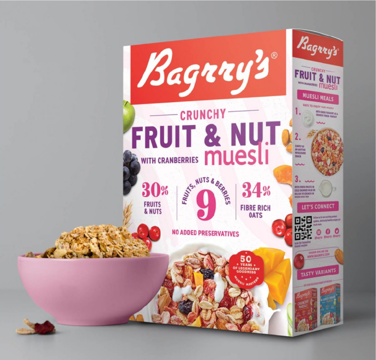
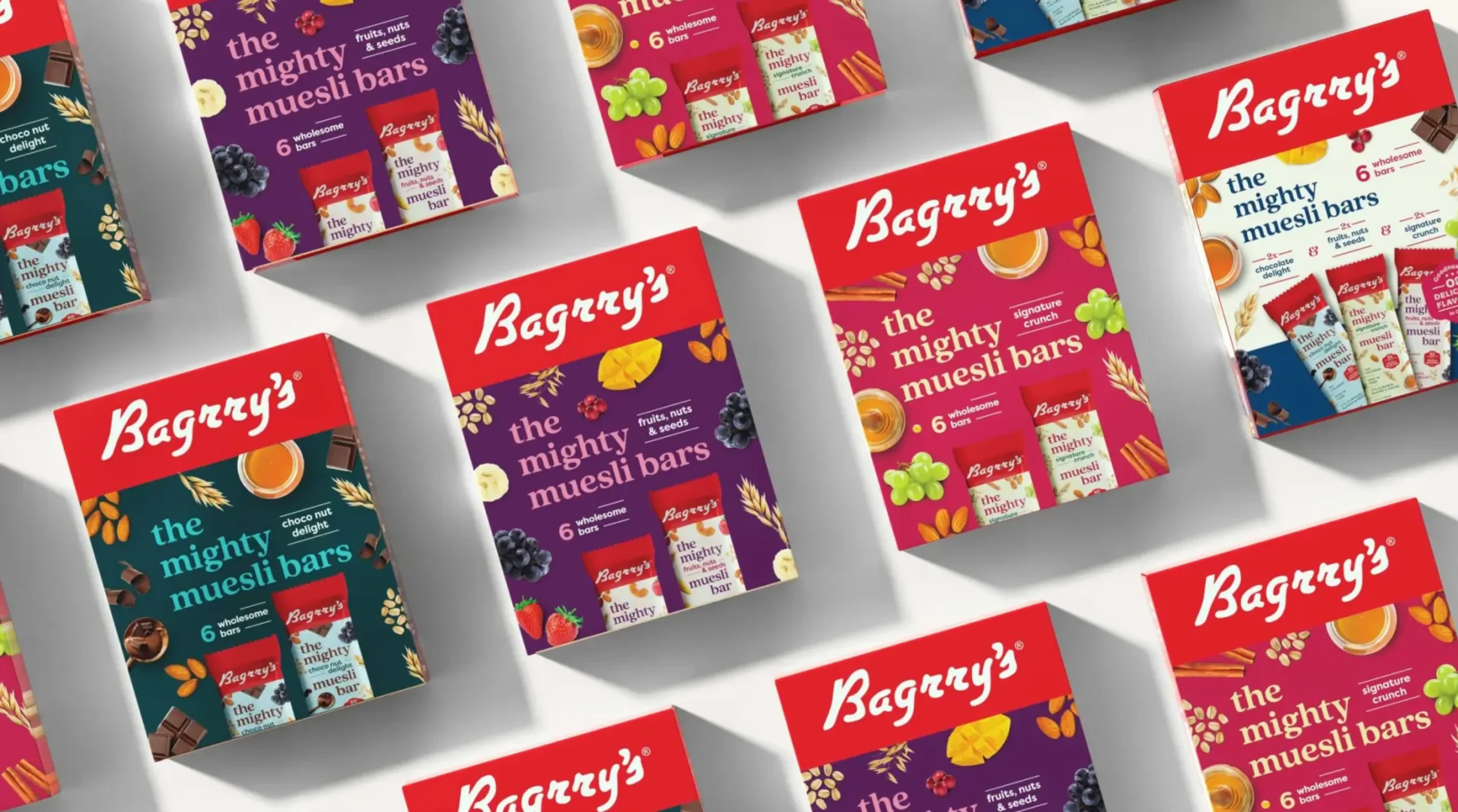
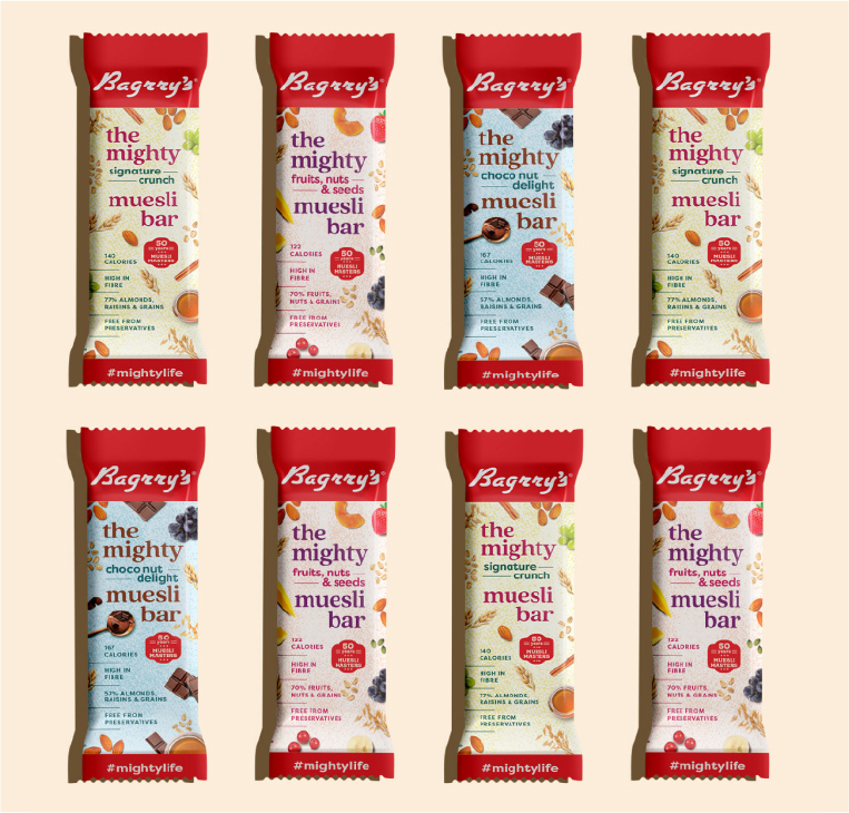
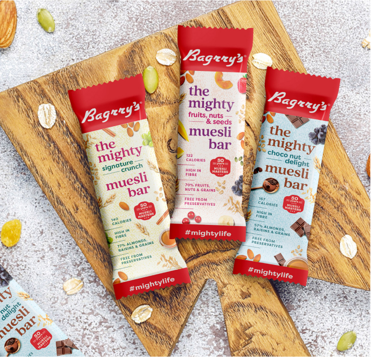
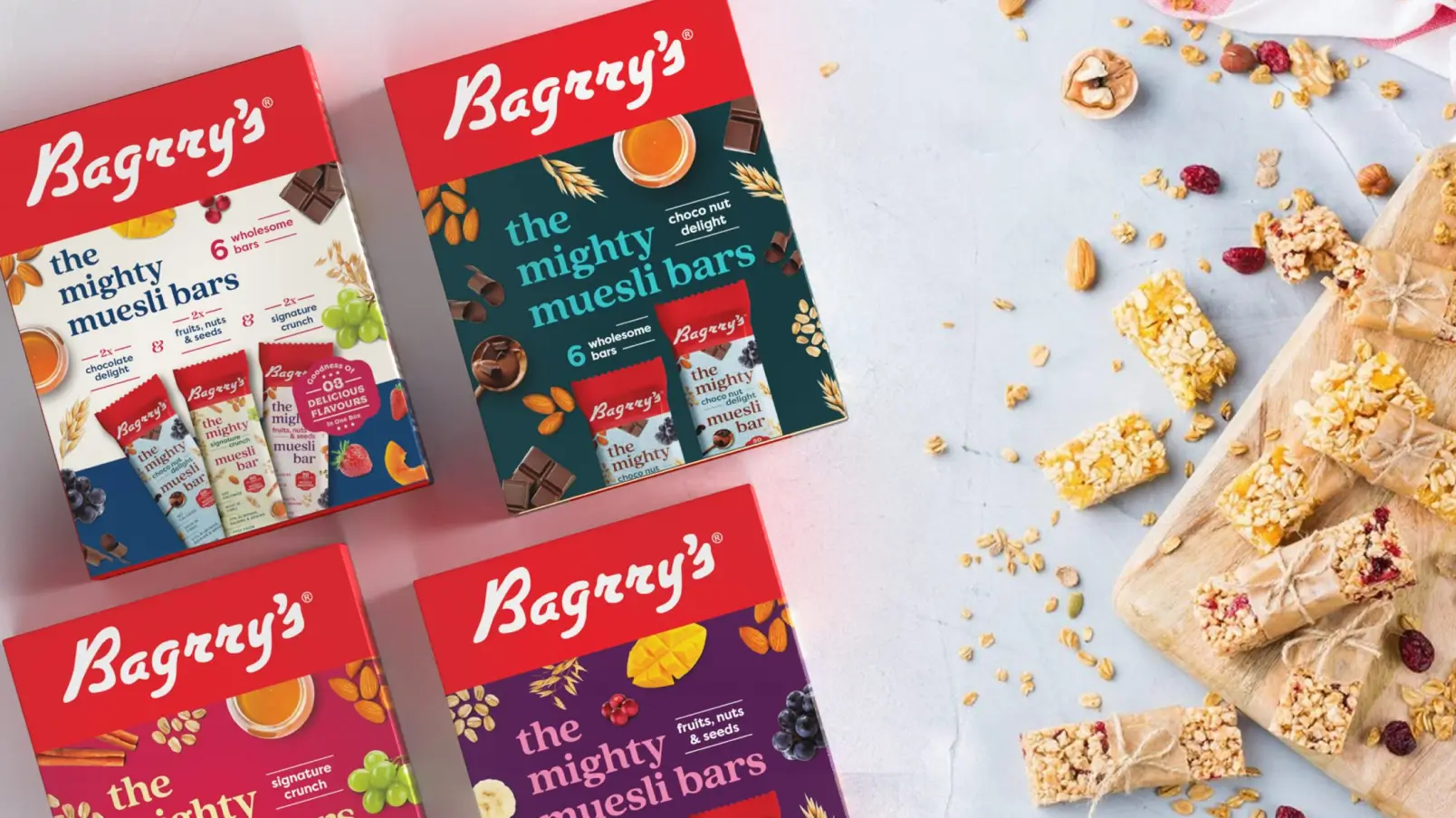
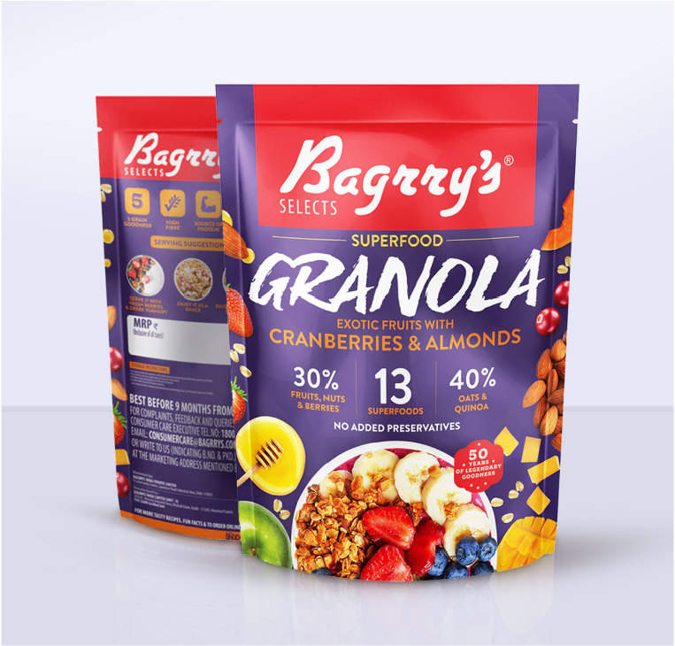
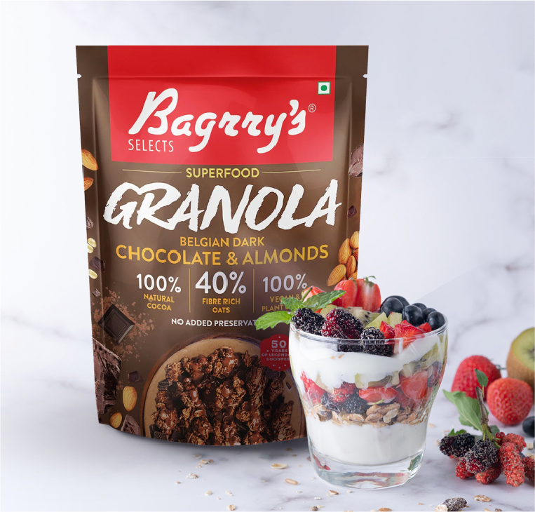
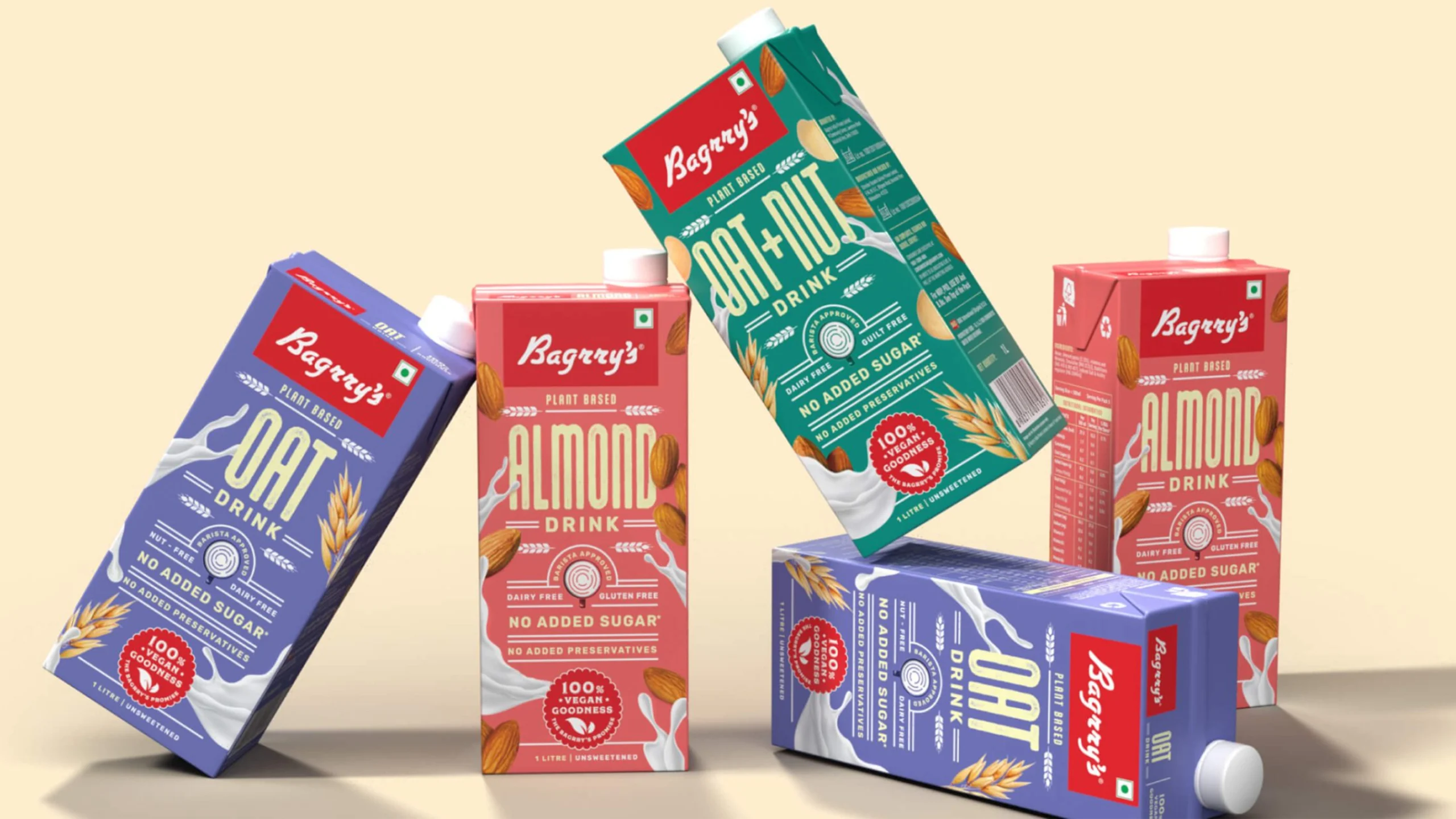
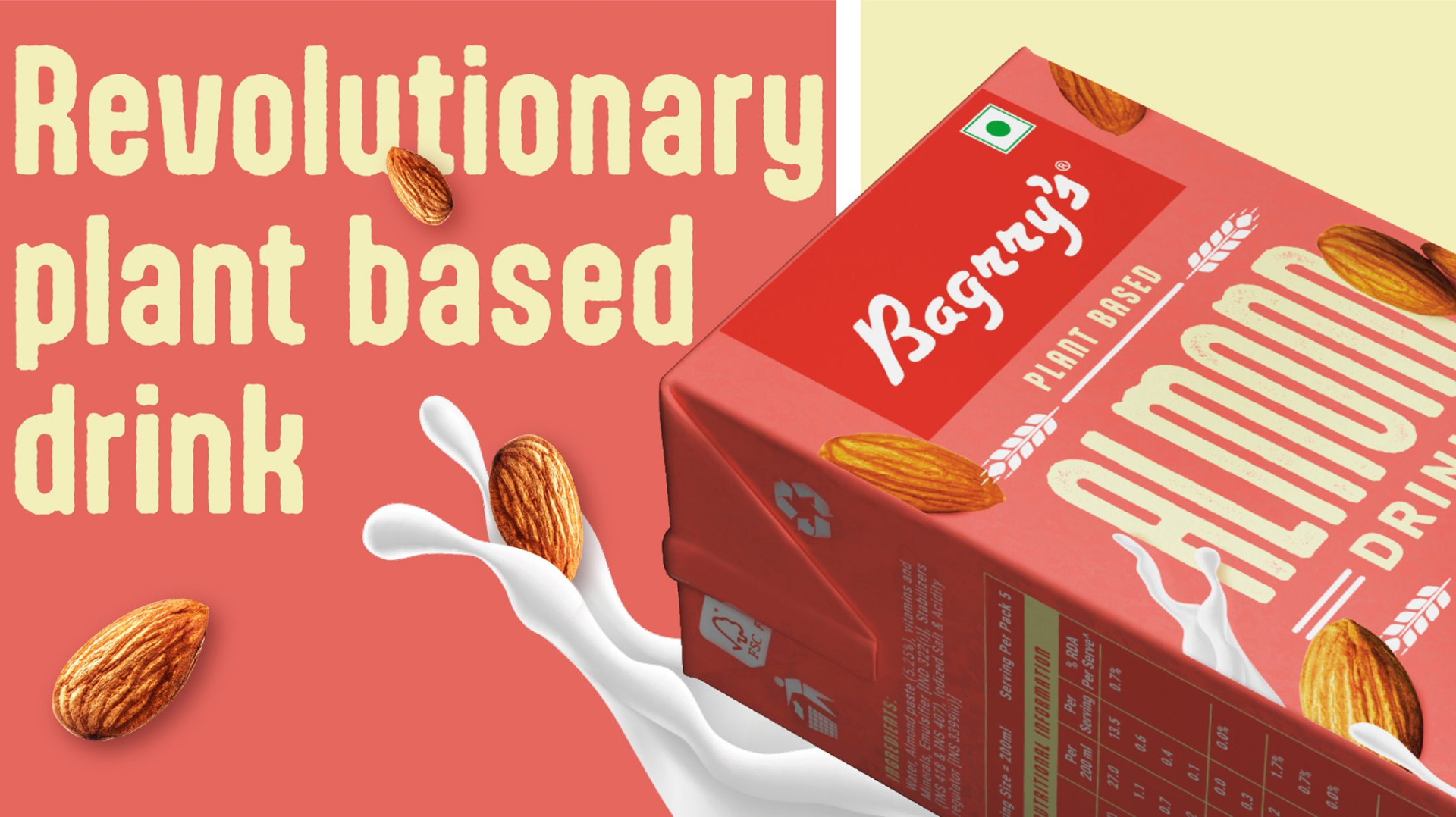
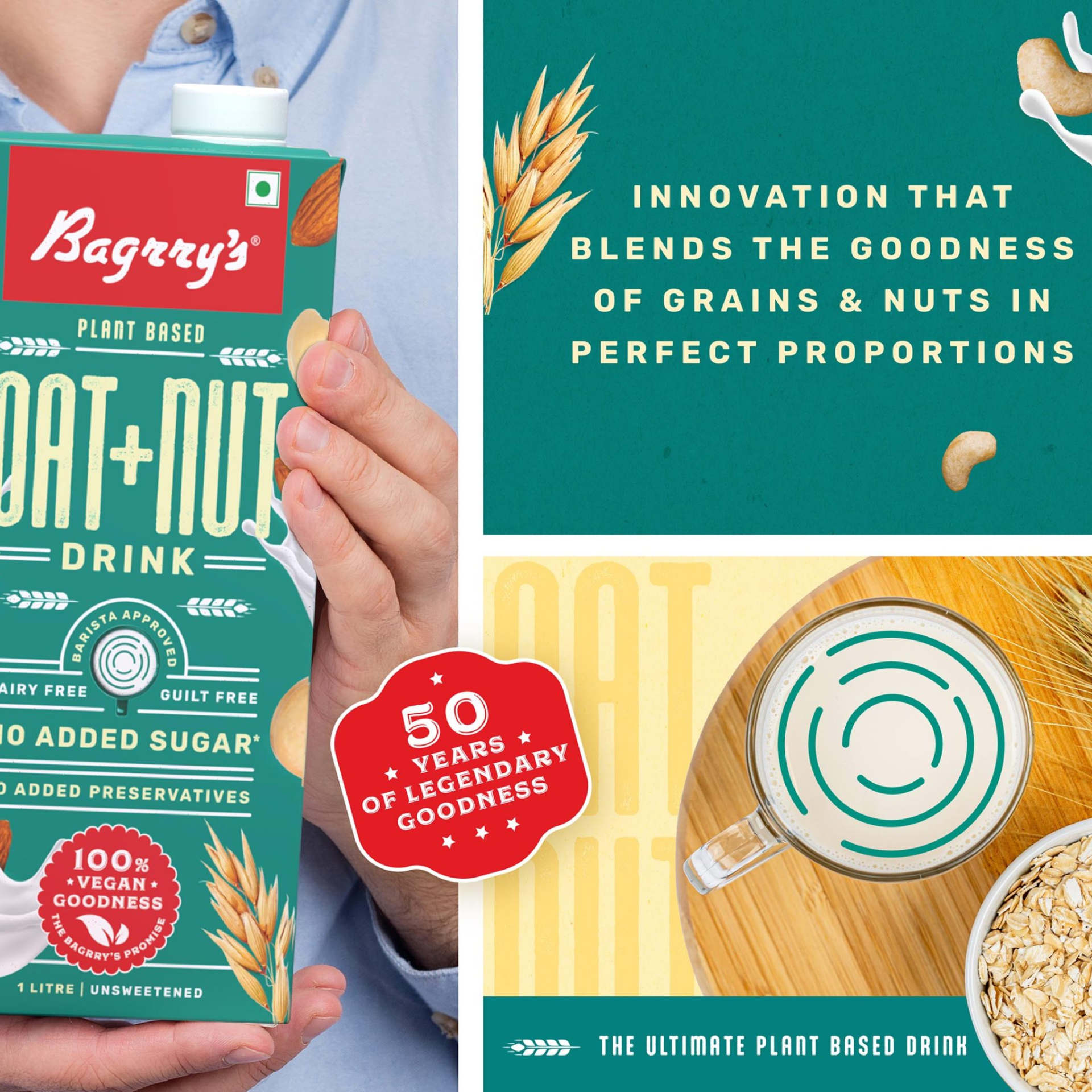
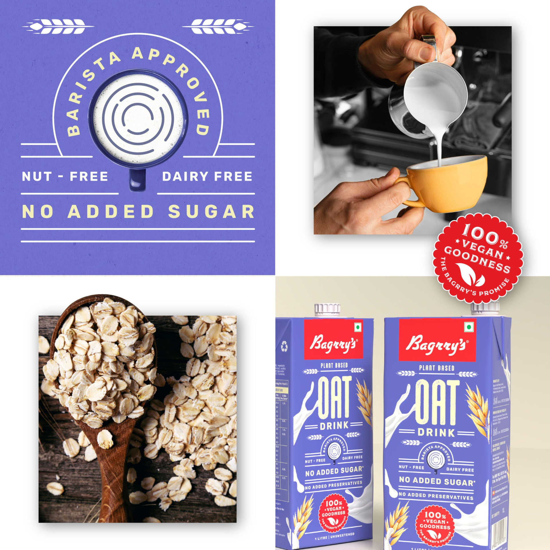
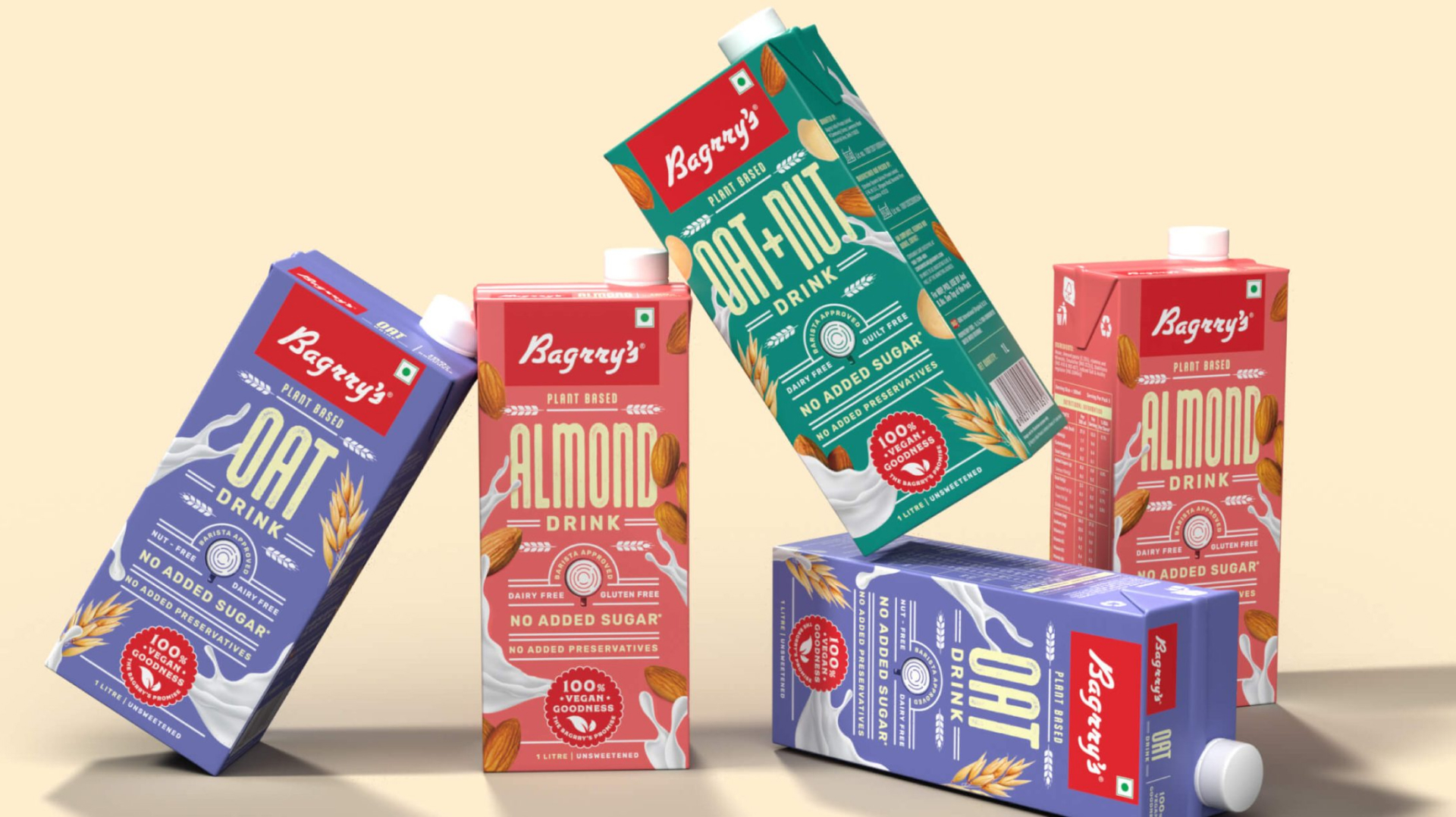
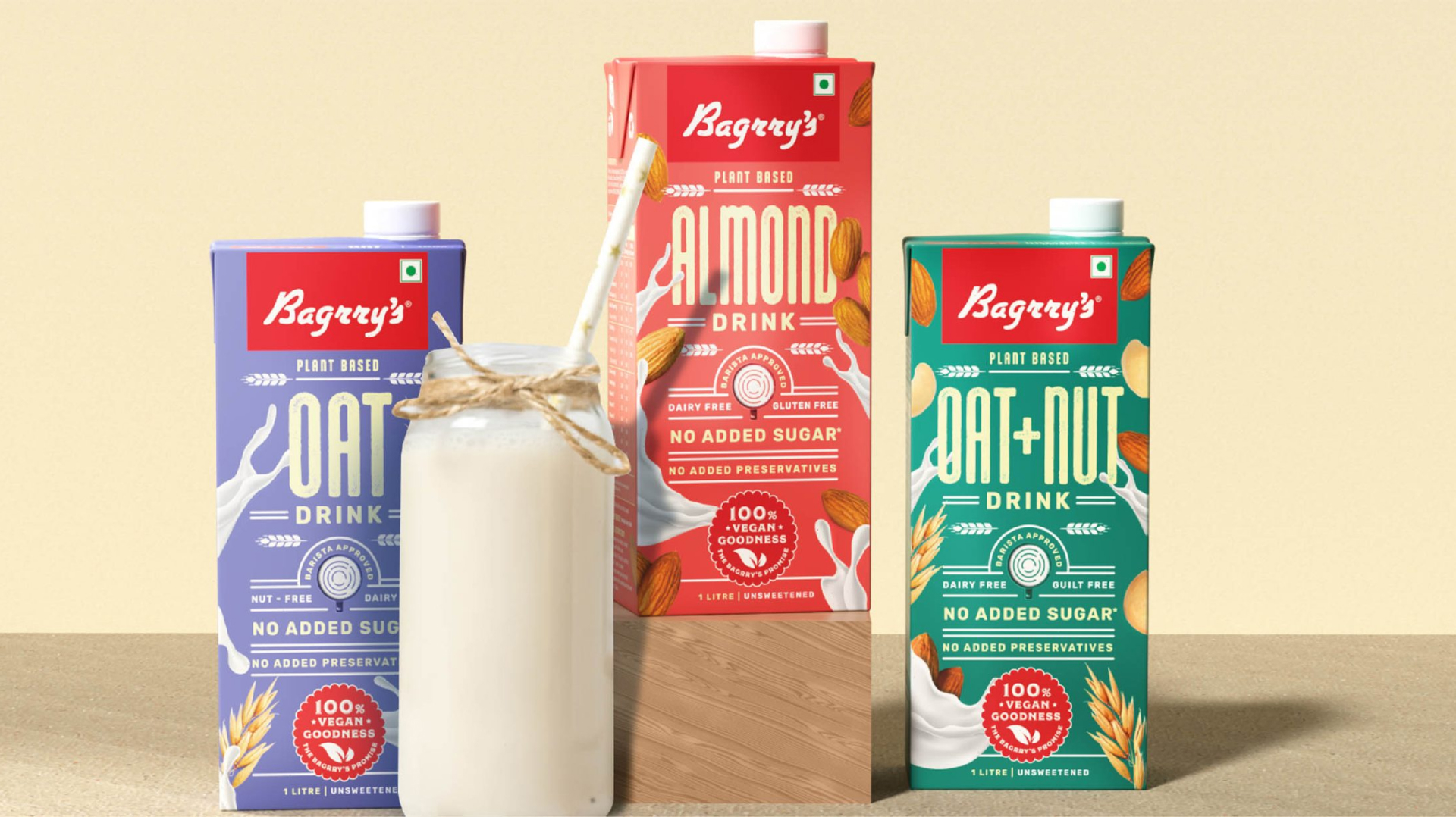
The red flag of the logo, the abundance of ingredients and prominence of the product were modernised to remain part of the brand’s narrative. For the muesli range refresh, we introduced a burst of colour to the Bagrry’s product family and built a strong differentiator between flavour variants. We highlighted the health benefits and kept the communication informative but easy to consume, with a splash of infographics and iconography on the back of the pack.

CATEGORY

Breakfast Cereals
and Healthy Snacks

SCOPE

Brand Architecture, Brand Identity, Packaging System

Bagrry’s

A HOMEGROWN GIANT’S NEXT CHAPTER

From a bold challenger to India's second-largest breakfast cereal maker, Bagrry's story is one of homegrown innovation taking on global giants. But this ‘Cereal Killer’ packaging needed to evolve for a hybrid retail future where digital and physical shelves demand different approaches to standing out.

We broke free from the sea of sameness in physical retail while maintaining the brand's trusted identity as it ventured into new territories like plant-based milk alternatives through typography-led design that both honours the Bagrry's breakfast legacy and signals its innovative future.

Up Next...

NUUK

Identity and Packaging System

Brand Strategy

Consumer Research

Positioning

The Soft Science of
Household Magic

The Soft Science of Household Magic

Project

NUUK

Identity and Packaging System

Brand Strategy

Consumer Research

Positioning